Wednesday, February 24, 2010

Sparkling Coneflowers

I created this card for the SCCSC5 Sketch Challenge on Stampin Connection.
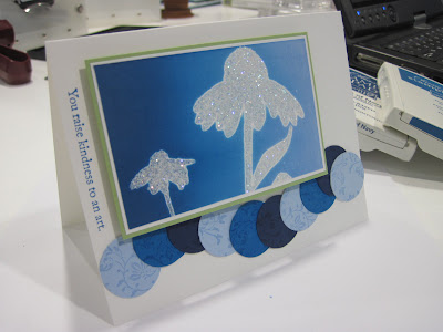
Stamps: Inspired by Nature, Vintage Vogue

Cardstock: Whisper White, Bashful Blue, Pacific Point, Night of Navy, Certainly Celery
Ink: Bashful Blue, Pacific Point, Night of Navy, Whisper White
Accessories: Dazzling Diamonds, Heat and Stick powder

The card base is Whisper White cardstock. I stamped the ivy flourish from Vintage Vogue on the sides of large sheets of Bashful Blue, Pacific Point, and Night of Navy with their matching inks. This created a subtle but noticeable pattern on the colored cardstock. Then I cut out several 1” circles using my Circle Scissor (since I don’t have the 1” circle punch) and mounted these in a wavy pattern overlapping each other and the bottom of the card. Then I stamped the sentiment from Vintage Vogue vertically on the left side of the card base in Pacific Point ink.


For the main image panel I stamped the coneflowers from Inspired by Nature in Versamark and embossed with Heat and Stick powder and Dazzling Diamonds glitter. Then I brayered the entire thing with Bashful Blue ink, then brayered from the left side to the right with Pacific Point and Night of Navy taking care not to completely cover the previous color. This gave the panel a very nice graduated color effect. This is mounted on a piece of Whisper White and then a mat of Certainly Celery helps it to stand out from the white and blues of the card base. This is one of my favorites of all the cards I have made. I just love this!

Razzleberry Medallion

I created this card for the SCFC5 Featured Stamper Challenge featuring Jen Diercks. First is Jen’s beautiful card that I CASED:


And here is my version:

Stamps: Medallion, Vintage Labels

Cardstock: Very Vanilla, Rich Razzleberry, Whisper White
Ink: Rich Razzleberry, Old Olive
Accessories: Old Olive 5/8” grograin ribbon
Techniques: direct to paper

For my CASE I used Rich Razzleberry instead of Chocolate Chip for the mat and the medallion image, and Old Olive instead of Dusty Durango for the ribbon and the sentiment. I also used the Vintage Labels set for the sentiment and the frame around the sentiment. I used the Curly Label punch to punch out the sentiment label. This is where I ran into some trouble. I didn’t have any Old Olive cardstock. So instead I used Whisper White cardstock and used the direct to paper technique with my Old Olive ink pad. After several swipes I had Old Olive cardstock. After all the ink dried I punched out another curly label and cut it in half and mounted the halves behind the first curly label. This was mounted to the card with scrap rubber to pop it up. What do you think?

Turquoise Coneflowers

I created this card for the SCCOLOR4 color challenge on Stampin Connection. The colors for this challenge were Certainly Celery, Garden Green, and Tempting Turquoise. This is what I came up with after a lot of effort.


Stamps: Inspired by Nature
Cardstock: Whisper White, Certainly Celery, Garden Green
Ink: Tempting Turquoise, Certainly Celery, Basic Black
Accessories: Whisper White organza ribbon
Techniques: Brayering, sponging, direct to paper

The Certainly Celery with Tempting Turquoise was pretty easy, but figuring out how to incorporate the Garden Green took me a while. I brayered the top portion of a piece of Whisper White cs with Tempting Turquoise ink. I sponged and used the direct to paper technique at the bottom with Certainly Celery ink. Then I stamped the coneflowers from Inspired by Nature in Basic Black in. This was cut out with the Top Note die. I also cut out a piece of Garden green with the top note die, cut it in half, and adhered it behind the image panel.

The card base is Certainly Celery with a strip of Whisper White that was stamped at the bottom with the sentiment from Inspired by Nature in Tempting Turquoise ink. For a finishing touch I added some White organza ribbon around the top note panel which was then adhered with scrap rubber to the card front to make it pop up. I really like this one and will have to try to use Garden Green more often.

Sunday, February 21, 2010

Bloomin Beautiful

I just can't wait for spring to come. I'm tired of snow, of being cold, and of cleaning my car off. It can be spring any time now. This card has pretty flowers and bright colors which remind me of the nice spring days hopefully soon to some.

Stamps: Bloomin’ Beautiful, Warm Words, Baroque Motifs
Paper: Tempting Turquoise, Certainly Celery, Garden Green, Whisper White
Ink: Bashful Blue, Sahara Sand, Soft Suede, Chocolate Chip, Basic Black, Stazon, SU markers
Accessories: Silver hodgepodge hardware brads, silver brads, Flower Fusion II (retired), and White organza ribbon.

I created this card for the SCCSC4 sketch challenge on Stampin Connection. The card base is Certainly Celery cs with a Garden Green mat behind a Whisper White panel that was stamped with the swirls from Baroque Motifs in Tempting Turquoise ink. I stamped “happiness” from Warm Words in Basic Black ink on the bottom right corner of the card and then added some Whisper White organza ribbon.

I stamped the pot of flowers and bumble bee from Bloomin’ Beautiful in black Stazon ink on Whisper White cs. I colored in these images with various SU markers then masked the bottom portion of the pot and sponged on Soft Suede and Chocolate Chip to create a table. I added a shadow behind the pot with Sarah Sand, and then cut out a 4 inch circle with my Circle Scissor. I sponged Bashful Blue around the edges and then mounted this onto a 4 ¼” circle of Certainly Celery. This panel is popped up from the card base with scrap rubber. Finally I added the brads from the Silver hodgepodge hardware, a silver brad, and two flowers from Flower Fusion II (retired). What do you think?

Sunday, February 14, 2010

SCFC4 Featured Stamper Jan Tink

I created these cards for the SCFC4 challenge on stampin connection. This week we are honoring Jan Tink for her beautiful creations. You can check out her blog by following this link. I was having a tough time choosing between two cards which one I wanted to CASE for the challenge. So I just decided to do both.   Here is the first card from Jan Tink's gallery that I chose to CASE:
Isn't this just GORGEOUS!!! Here is my version:

Stamps: Delightful Decorations
Cardstock: Real Red, Whisper White
Paper: Christmas Cocoa DSP
Ink: Real Red
Accessories: Silver brads, silver cord, green Mistletoe ribbon, eyelet border punch.
Technique: Sponging

I used silver chord instead of gold, three brads instead of two, the green Mistletoe ribbon instead of the red and white, and I used a different ornament from Delightful Decorations. I’m pretty sure that my card is larger than Jan Tink’s, but it’s hard to tell in the photo. Mine is 5.5” square.

This is the second card I chose to CASE:
And here is my version:


Stamps: Simple Snowflake, Christmas Greetings
Cardstock: Kraft, Bashful Blue, Night of Navy, Whisper White
Ink: Night of Navy
Accessories: Silver eyelets, silver brads, silver cord, Simple Snowflake punch.
Technique: Sponging

For this card I couldn’t tell what ink color Jan Tink used, I’m pretty sure it’s Bashful Blue, but I decided to go for a little more contrast and use Night of Navy. I also added a Night of Navy panel, instead of piercing the paper I just added a score line, and instead of using the Word Window punch (which I don’t have yet) I just used a rectangle of Whisper White CS.

Jan Tink is such an inspiration and her blog is always entertaining to read. I had such a wonderful time perusing her gallery to chose cards to case and recreating her beautiful cards.

Wednesday, February 10, 2010

Masculine Valentine, SCCSC3

I created this card using the sketch challenge SCCSC3 from Stampin Connection for a valentine to give my DH. He really wouldn't appreciated one that was pink and red with glitter all over it so I settled for black, grey, and red.

The card base is Going Grey that was stamped with the flourish from Friends 24-7 in Going Grey ink. I used the stamp-a-ma-jig to layout the pattern so it looked like DSP. The strip of Real Red cs was punched with the Scallop Trim border punch and I added some Mistletoe ribbon from the holiday mini catalog. This was adhered to a piece of Basic Black and then to the card front. The main panel is Whisper White with "love you much" from Well Scripted (occasions mini catalog)in Real Red ink. This was layered on Real Red, Basic Black, and Going Grey cs. The three brads were then added before this panel was adhered to the card with some scrap rubber to add some dimension.

I think my DH will appreciate this valentine, but if not at least it was fun to make.