Tuesday, July 6, 2010

Bashful Black and White Butterfly

This is the second and final card I made for the Black and White with a Splash Swap that was posted on Stampin’ Connection. These were a little difficult to design but I really like the effects of working with limited supplies while still trying to make the card exciting. Take a look!


Stamps: Baroque Motifs
Cardstock: Whisper White, Basic Black
Ink: Basic Black, Whisper White Craft
Accessories: 5/8” Bashful Blue Satin ribbon, Bashful Blue brads, Designer Label punch, Beautiful Wings Embosslit Die, Dazzling Diamonds glitter, Crystal Effects

The card base is Whisper White cardstock cut at 5 ½” x 8 ½” and scored at 4 ¼”. The next layer is a piece of Whisper White cardstock cut at 4” x 5 ¼”. I then ran this piece of cardstock through the Big Shot with the Square Lattice Texture Impressions die. Then the brayer was used to add Basic Black ink to the raised texture to make it stand out more.

Then I used the Big Shot with the Top Note die to cut out a piece of Basic Black cardstock. This was then stamped with the swirls from Baroque Motifs in Whisper White craft ink. After the craft ink dried added a piece of 5/8” Bashful Blue Satin ribbon around the top note.

On a scrap piece of Whisper White cardstock I stamped the sentiment in Basic Black ink and next to the sentiment I stamped the flower by stamping off (Inking up once, stamping on a piece of scrap paper, and then stamping on your project). This was punched out with the Designer Label punch. I also punched out another Designer Label from Basic Black cardstock and another from Whisper White cardstock. The two non-stamped labels were cut in half long-ways with scissors and adhered behind the stamped Designer Label to add layers. This was adhered to the Basic Black top note.


The butterfly was cut with the Big Shot and the Beautiful Wings Embosslit Die from Whisper White cardstock. I used Crystal Effects to color in the embossed lines and added Dazzling Diamonds glitter. Then after that was dry I covered the entire butterfly with a layer of Crystal Effects to make it shiny. After the butterfly was dry the needle tool was used to pierce two holes through the center of the butterfly. Two Bashful Blue brads were inserted into the holes to make the butterfly body. Then I used the needle tool to curl the butterfly wings and give them some shape. This was adhered to the Basic Black top note with a couple of Mini Glue Dots.


The main image panel was adhered to the card front and it was done! This one involved some drying time but was well worth the wait!

On a side note to the other demonstrators who participated in the swap. I apologize for using Bashful Blue ribbon and brads. I knew that Bashful Blue was not a retiring color, but did not realize until now that the Bashful Blue 5/8” Satin ribbon and brads were retiring. However, this could easily be duplicated with 5/8” Marina Mist Satin ribbon and Marina Mist brads.

I hope you’ve enjoyed taking a peek at this creation! Come back tomorrow to see something fabulous created with the Ornament Punch!

Monday, July 5, 2010

Black and Grey Flourishes

Recently I participated in a swap on Stampin’ Connection. The idea was to make a card that was entirely black and white with a little splash of color. But the color could not be ink or cardstock. Tricky huh? Well this is the first of the cards that I came up with and the “splash” of color is Very Vanilla!


Stamps: Friends 24-7, Baroque Motifs
Cardstock: Basic Black, Whisper White
Ink: Basic Black
Accessories: Vanilla Hodgepodge Hardware, 5/8” Vanilla Satin ribbon, Stamp-A-Ma-Jig, Designer Label Punch


The card base is Whisper White cardstock cut at 4 ¼” x 11” and scored at 5 ½”. The image panel is a piece of Whisper White cardstock cut at 3 7/8” x 5 1/8”. I then used the Stamp-A-Ma-Jig with the flourish from Friends 24-7 and Basic Black ink to make my own designer paper. After the patterned paper was completed I used the swirls from Baroque Motifs inked up with Basic Black, but before I stamped the image panel I stamped a couple of times on a piece of scrap paper and then stamped on the image panel. This made the image in a shade of grey that looks to be behind the Basic Black flourishes even though it was from the same ink pad. This technique is called stamping off.

The image panel was then adhered to a piece of Basic Black cardstock cut at 4 1/8” x 5 3/8”. On a piece of scrap Whisper White cardstock I stamped the swirls from Baroque Motifs just like I did earlier by stamping off. Then I used the sentiment from Friends 24-7 in Basic Black ink on top of the swirls. This was then punched out with the Designer Label punch. I added the label to the front of the image panel using the Designer Label hardware and brads from the Very Vanilla Hodgepodge Hardware kit.

The image panel was adhered to the card base and a piece of 5/8” Very Vanilla Satin ribbon was added and tied into a knot. I really like how elegant this one turned out. Making the designer paper took a little while, but it was well worth it!

Come back tomorrow to see the other card I made for the Black and White with a Splash Swap! I just know you’ll love it!

Sunday, July 4, 2010

Father's Day Light

First off let me say HAPPY 4TH OF JULY!!!!!


I really love 4th of July, but I will be glad when people in my neighborhood quit shooting off fireworks. Now on to crafty stuff!

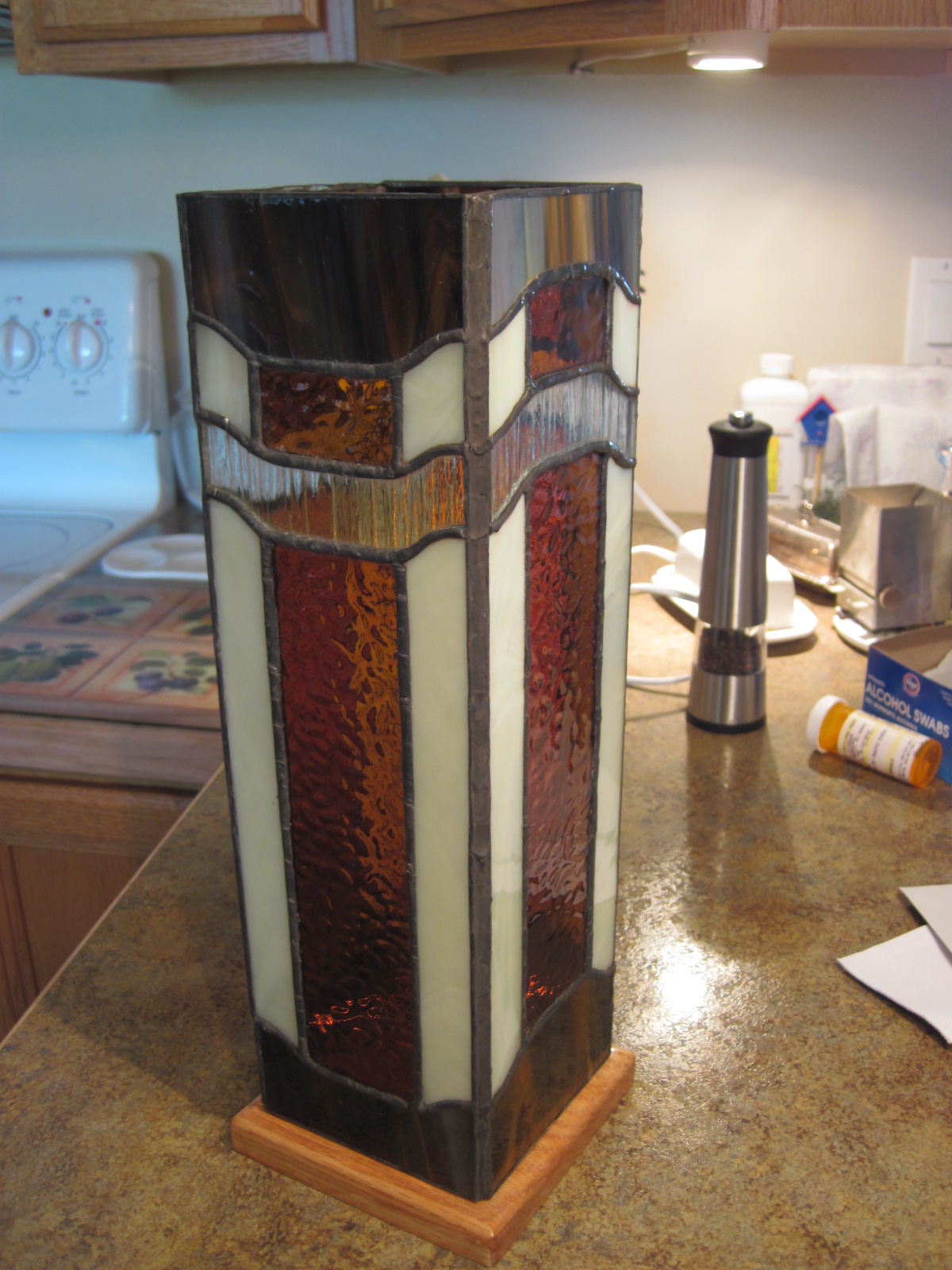
One of my many other hobbies other than paper crafting is stained glass. I just love how the rich colors look with the light behind them. Well...here is an accent lamp that I made for my Dad for Father's Day.


The pattern came from the "Box Column Lanterns" book by Jill Williams. I used tones of white, amber, and brown with a textured clear glass. The wooden base was made and finished by my husband.

I enjoy a large variety of crafts, but paper crafting is the one I do the most of because it is much faster and more instant gratification than others, but I truly love the results of time well spent carefully crafting things such as this lamp. Now, maybe someday soon I will make myself an accent lamp.

Don't worry, I will have more paper craft goodies to show you tomorrow. I just had to get this one in here.

Saturday, July 3, 2010

Samp-A-Ma-Jig

No...that is not a name I made up for this tool. It really is called a Stamp-A-Ma-Jig. Sorry for not getting this posted until late in the day. I swear my husband and I have been running around all day long! For the sample I used one of the cards from the last make and take since I had all the pieces cut already and it was a good example.

Have you ever made a card and been almost finished with just the sentiment left to do on a card that took a while to complete, and then stamped the sentiment crooked. Yeah, I know it's faster to make it the second time because you already know what to do. But it still irritates you. Well this tool is a great way to make sure that any stamped image is straight and right where you want it. I think its the best tool ever and I use this all the time.

The Stamp-A-Ma-Jig comes with a clear plastic sheet and a handle. It doesn't matter if you're right handed or left handed because this tool will work on both sides of the handle.

Place the clear plastic against the side and the top of the handle. You want to make sure that the plastic is all the way into the corner of the handle.


Ink up your stamp and stamp the image while making sure that the stamp block is all the way into the corner of the handle. You want the block touching both the side and the top at the same time.


Now that your image is stamped on the plastic you can move your plastic to line up your image where you want it. I stamped the trunks of the trees already and now I just need to line up the tops of the trees. I stamped all of the tops on the plastic at once, which is why the stamp image below is different from the one you see above.


Now that your image on the plastic sheet is lined up where you want it position the handle against the plastic sheet and use some pressure to make sure the handle doesn't move.


Pull the plastic sheet away and set it aside without moving the handle.


Ink up your stamp and stamp your image making sure that the block is all the way into the corner of the handle.


Now you can pick up your stamp and move the handle aside. Your image is perfectly positioned right where you want it! Isn't this fabulous!


This also works great for sentiments. Just repeat the steps above with your sentiment stamp.


Now you can assemble your card with everything stamped and perfectly positioned.


I hope you enjoyed this tutorial. To see the post on the card shown above click here. Please let me know if there is any other product that you would like to see a tutorial on.

Come back tomorrow. I have something completely different, pretty, and masculine to show you. I'm sure you'll be suprised!

Friday, July 2, 2010

Almost Amethyst Window Card

Here is the final project that my guests made at the June Make and Take. Enjoy!


Stamps: Pocket Silhouettes, Watercolor Trio
Cardstock: Whisper White, Sahara Sand, Almost Amethyst
Ink: Almost Amethyst, Elegant Eggplant
Accessories: Curly Label punch, Whisper White Taffeta ribbon, and Elegant Bouquet Texture Impressions die.


The card base is Sahara Sand cardstock cut at 4 ¼” x 11” and scored at 5 ½”. The panel of Almost Amethyst cardstock is cut at 4” x 5 ¼” and is run through the Big Shot with the Elegant Bouquet Texture Impressions die. This is then adhered to the card front.

Then use the Curly Label punch on the bottom right hand corner to punch through both layers.

Tip: When you glue down you Almost Amethyst cardstock, make sure you don’t put adhesive where you punch. Then you will have two punched pieces that can be used on another project or go into your scrap bin.

On a scrap piece of Whisper White cardstock stamp the leaves from Pocket Silhouettes in Almost Amethyst ink. Then stamp the sentiment on top of your leaves in Elegant Eggplant ink. Hold the Curly Label punch upside-down so you can see where the punch is going to cut. This allows you to line up your leaves and sentiment in the center of your punched piece. Punch out your leaves and sentiment.

Close your card. Add adhesive to the back of the stamped Curly Label punched piece of Whisper White. Adhere the label to the inside of your card by placing it inside the window on the card front. This allows you to get it perfectly lined up on the inside. Add a piece of Whisper White Taffeta ribbon through the window opening and around the side of the card.

Use the Big Shot and the Beautiful Wings Embosslit die with a small piece of Whisper White cardstock to cut a large butterfly. I really love this die because it cuts and embosses several beautiful butterflies at once. Use a needle tool to punch two holes through the cardstock in the center of the large butterfly. Add two silver brads. Use the handle of the needle tool or a pencil to curl the wings.

Tip: If you bend the legs of the brads to form a V shape under the butterfly then the brads will help to hold your butterfly wings up and give your butterfly more dimension.


Glue the butterfly to the front of the card using a mini glue dot. You’re done!


Don’t forget to check out all of the wonderful new products in the new Idea Book & Catalog! Click the link on the right sidebar to view a PDF file of the catalog or click the Shop Stampin’ Up Now! button at the very top of the right sidebar to shop online instantly!

Come back tomorrow to see a tutorial on how to use the Stamp-A-Ma-Jig!

Thursday, July 1, 2010

Vanilla Watercolor Card - June Make and Take 4

 This is the fourth card that my guests made at the June Make and Take. It was inspired by a card created by Tara Bilbao on Stampin’ Connection. I just like the Very Vanilla tone-on-tone with the cardstock. Well…see for yourself!


Stamps: Watercolor Trio, En Fraincais
Cardstock: Very Vanilla, Old Olive
Ink: Old Olive, Sahara Sand
Accessories: 5/8” Very Vanilla Satin ribbon, Markers: Bashful Blue, Almost Amethyst, Old Olive, Certainly Celery.

The card base is Very Vanilla cardstock cut at 4 ¼” x 11” and scored at 5 ½”. On top of this is a 3 ¾” x 5” piece of Very Vanilla cardstock. This was first stamped with the background stamp En Fraincais in Sahara Sand ink. Then the leaves from Watercolor Trio were used with Old Olive ink on the left side and bottom of the cardstock. To get the variations in ink I inked the stamp once, but stamped twice. This is stamping off. It allows you to use the same color ink and get varying depths of color. This is then adhered to the card front.

The image panel is a 1 7/8” x 2 3/8” piece of Very Vanilla cardstock. I used the Bashful Blue, Almost Amethyst, Certainly Celery, and Old Olive markers to color the flower stamp, breathed on it, and stamped it twice. Then inked it again with the markers and stamped it two more times. This was then sprayed with Vanilla Shimmer Smooch Spritz to give the image panel a light sparkle. This was adhered to a 2” x 2 ½” piece of Old Olive cardstock and then the layers were adhered to the card front. A piece of 5/8” Very Vanilla Satin ribbon tied around the card front and in a knot finishes it off.

I hope you enjoyed seeing this card. Come back tomorrow to see a simple Almost Amethyst Window card!