Monday, June 4, 2012

Disney Fantasy Vacation!

Hello everyone! Last week I had the most fantastic Disney Cruise vacation with my husband and some of my family! It really was a dream come true and we had a great time! The Disney Fantasy is Disney Cruise Line's newest ship and sailed on it's maiden voyage back in March. Here are some fun facts about this beautiful ship:

There are 14 decks, 1,250 staterooms, accommodates 4,000 guests and 1,450 crew, and the overall length of the ship is 1,115 feet!

The ship has loads of activities not only for kids and families, but many adult only areas as well! My husband and I don't have any kids and we had a fantastic time! The service is excellent, the ship is beautiful, and the food is terrific!

So here are some of my vacation pictures, be prepared, there are a lot!

These are photos of some of the bar areas in Europa, the adults only club section of the ship. This particular area was called La Piazza. The bar actually looked like a carousel with all the lights. It was gorgeous.


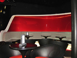
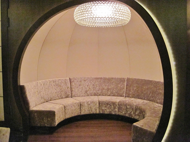
This is Ooh La La. So many pretty seats. The walls looked tufted and had little lights for the "buttons" in the tufting. 


This lounge is called The Tube. It was meant to look like the London underground. The ceiling of the bar looks like you're inside Big Ben and there were these glowing orbs on the ceiling that look really cool. 


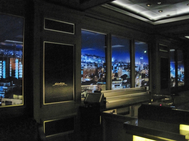
This is Skyline. The walls have a scene of a city skyline that changes from day to nigh and the skyline changes daily to a different city. This was amazing and so detailed that you could see cars and people moving! This particular scene was Port Canaveral. 


This was quit cove pool in the adults only section. The adult section actually has three different pools. This is just one part of the pool that had only a couple inches of water and a mister in the center, to the right is the deeper swimming pool. 


Goodbye Port Canaveral....


We're heading out into the open ocean! 


These beautiful crystal chandeliers were everywhere around the atrium on Deck 3! So pretty! 


Here is my husband spinning my niece Lauren around in the atrium. 


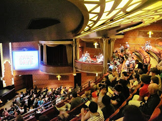
The Walt Disney Theater where Broadway style shows were performed with amazing special effects! No pictures or filming allowed during those, sorry. But they were fantastic! 


A statue of Mickey outside the theater. 


We had a dry erase board on the outside of our stateroom door and Micky Mouse signed it! 


The lit up Disney Cruise Line logo on one of the stacks. So pretty! 


It was really cool getting to see the AquaDuck, the only water rollercoaster aboard a cruise ship, lit up at night! 


The Funnelvision (gigantic TV on deck). 


We had a wonderful brunch at Palo on Sunday. Here is my dessert! 


And the view from Palo, with my mom on the left. 


This beautiful blown glass fixture was at the entrance to Palo. Absolutely stunning! 


We also had a blast playing in the family pool on Sunday. This is my husband and my nieces, Lauren on the left and Megan on the right. 


They happened to have Toy Story playing on the Funnelvision that day. 


There was really beautiful artwork all over the ship and even enchanted art work that would animate when you stepped up to it. Gotta love Disney Magic! 


The atrium was decorative in a Peacock patterns and colors. It was absolutely gorgeous! 


There were beautiful tile and glass mosaics everywhere on the ship. This area was next to the atrium on this side is Cinderella's carriage, on the other side was Aurora's castle! 


The elevators in the atrium. Beautiful scroll work! 


The stunning chandelier in the atrium that was really hard to get good photos of. 


When you're from the Midwest its pretty amazing being surrounded by ocean! 


The view of the ship from the pier in Grand Cayman. The water is too shallow here for the ship to pull up to the pier so we had to ride on tender boats to get from the ship to the pier. 


There's nothing like napping on Deck 4. This is where the lifeboats are stored overhead, but the deck is lined with oh so comfortable lounging chairs and the lifeboats provide shade. It's so quiet down here with just the sound of the ocean going by and usually a breeze. The perfect place to read or nap. 


This is the ceiling in Enchanted Garden, one of the restaurants. Throughout the evening the flowers on the ceiling change color and open up and the ceiling transforms into a night sky with stars. It was gorgeous! 


This is Cozumel, Mexico.


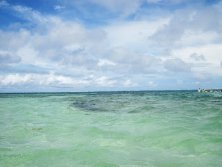
Costa Maya, Mexico where we went snorkeling. 


These are just a few of the photos I took while snorkeling. I got some really great pictures, but I thought that there was a lot more to see when we went snorkeling in Cozumel back in 2010. 


This is a restroom near another lounge called Outlook. I just thought that it was cute how the lights and mirror looked like Mickey! 


This is Outlook. It is a lounge that is all the way in the top of the forward stack. 


What a view of the ship all lit up at night! 


 Castaway Cay, Disney's private island in the Bahamas. My husband and I went out on a peddle boat and this was the view of the ship from there.  


Serenity Bay, the adults only beach at Castaway Cay. 


We had plenty of yummy alcoholic drinks while vacationing, but this one was by far the best. It is a Creme Brulee Martini that I got in Meridian, the lounge at the top of the aft stack right next to Palo and Remy (adults only fancy restaurants).


 You could see different Disney characters all over the ship and take photos with them if you wanted. Here is Mickey! 


We had a fantastic time cruising on the Disney Fantasy. I didn't take anywhere near enough photos of the ship! I guess I will have to fix that when we sail on her again next May! My husband and I are cruising on the May 4th Eastern Caribbean that goes to St. Thomas, St. Martin, and Castaway Cay! 

Thanks for stopping by! 

Saturday, June 2, 2012

New Stampin' Up Ink Pads

Stampin' Up has really outdone themselves with creating these great new Classic Ink pads! I just know as soon as you use them you will LOVE them! Here are some of the wonderful features of these great new ink pads:

  • New firm foam pad for better ink coverage. 
  • patented flip-top design store ink upside-down to keep pad moist (as before)
  • Fast-drying, dye based, acid-free ink
  • New color name labels in your language for easy identification

When they say better ink coverage they really aren't kidding! Remember before with the felt ink pads you would really have to check to make sure that your stamp was covered completely. Or sometimes you would have certain stamps that were nearly impossible to get the center inked up well (like the pine tree from Lovely as a Tree for me). Or solid stamps that just wouldn't come out perfectly stamped like you would expect? Well with the new ink pads you don't have to worry about that!

Here, take a look at Lovely as a Tree inked up with Basic Black in the felt ink pad. I have always had trouble with this stamp getting the center of the tree to be stamped nice and clean. Please note, I am not doing anything differently with the felt pads than I always have. The image on the left was stamped with the old Basic Black ink pad. The image on the right was stamped with the new Basic Black ink pad. Big difference!


The new ink pads are so great! All you have to do is lightly, and I do mean lightly tap the stamp on the pad 3-4 times to get it completely inked. If you press the stamp down like you used to for the felt pads you will get ink on the outside edge of the stamp.

Now for solid images. Before you used to have to really condition solid image stamps to get a decent looking image. On the left is an image from Mixed Bunch that I conditioned and stamped in the old Basic Black ink pad. On the right is the same stamp stamped with the new Basic Black ink pad.


Once again, with the new pads you just need 3-4 light taps to get good ink coverage. The resulting stamped image looks like something you would get out of a printer! So solid!

Also, another fabulous feature is the label sticker that comes on the bottom of the ink pad, just peel off the one in your language and stick it on the end of the ink pad! No more having to guess which color is which when you have them stacked up!

I know I'm sold! I totally want all of the new ink pads. After using the new ones, I dread having to work harder to use the old ink pads like before! Just try one and I know you'll fall in love! On another note, if you do plan on getting the entire collection of new ink pads you will save nearly 20% on the Brights, Subtles, Regals, and Neautrals collections and nearly 23% on the In Color sets when you buy the Card Stock & Pad Kit!

Click HERE and click Shop Now at the top to order yours!

Thanks for stopping by! 

Friday, June 1, 2012

Here's to You and Friday Mashup 61

Hello again everyone! I'm super pleased to announce that between June and December I am a Guest Designer over at the Friday Mashup! I'm so excited to be a Guest Designer! (Insert high pitched squeal and crazy looking happy dance here). So here is my first Guest Designer sample! 


The challenge this week is all about scraps! The challenge is to make a project with scraps of patterned paper and ribbon, make a scrapling, or make a scrapling using scraps of patterned paper and ribbon. Well, first off I didn't know what a scrapling was so I will fill you in just in case you don't know either. A scrapling is the left over piece from creating a square card from a 4-1/4" x 5-1/2" card base. It could be used as a tag or a bookmark or whatever. But that is what it is. 

Well I don't make square cards very often so I opted to just create a card from scraps. I had these pieces laying around on my table from putting together a Craft Project Central project (which you will see in June). 


Now my scrap pile has been getting really out of control lately. I've just been so busy working on many things (that you will get to see later) that I just haven't had time to sort through the stack and put away my scraps. So absolutely everything for this card except for the stamped images were already on my work table. Even the ribbon! I'm going to have to spend some serious time getting my craft room cleaned up when I get back from vacation!


  • Stamps: Friendly Phrases, Papaya Collage
  • Card Stock: Crumb Cake, Midnight Muse, Very Vanilla, Summer Starfruit
  • DSP: Comfort Cafe 
  • Ink: Midnight Muse, Summer Starfruit
  • Accessories: Pool Party Seam Binding Ribbon, Decorative Label Punch, Stampin' Dimensionals, Mini Glue Dot, Pearls


Anyway...on to the card. I started off with a piece of Crumb Cake card stock cut at 5-1/2" x 8-1/2" and scored it at 4-1/4". The scalloped Midnight Muse card stock started out at 1-1/2" x 5-1/2" before being punched. I didn't measure the strips of Comfort Cafe DSP, but they look to be about 1" wide. I adhered on on top of the Midnight Muse card stock and adhered that strip onto the card front. Then I simply adhered the remaining strips one right next to the other. I wrapped a piece of Pool Party Seam Binding ribbon around the card front and tied it into a bow.


For the greeting I stamped it Summer Starfruit ink and the image from Friendly Phrases on a scrap of Very Vanilla card stock. I punched out the greeting with the Decorative Label punch. Then I used the Decorative Label punch again on a scrap of Summer Starfruit card stock. I cut the Summer Starfruit label in half and cut off the points that were on the long sides and adhered it behind the Very Vanilla label to create a mat.

I stamped the butterfly from Papaya Collage onto a scrap of Very Vanilla card stock in Midnight Muse ink. I cut out the butterfly with Paper Snips and adhered it onto the label with a Mini Glue Dot. I added a few Pearls onto the butterfly to create the body then adhered the label onto the card front with a couple Stampin' Dimensionals.

That's it! I hope you join in the fun over at the Friday Mashup! Head over there now to see what the rest of the Design Team has created!

Thanks for stopping by! 

Introducing the New In Colors!

Every year Stampin' Up comes out with five brand new In Colors that are added to their large variety of color options. You can buy products in these colors for two years before they are retired and we get a new set of In Colors. Since we said a final farewell yesterday to the 2010-2012 In Colors it is now time to welcome in the new 2012-2014 In Colors!

Hello Summer Starfruit! 


 Hello Primrose Petals! 


Hello Raspberry Ripple! 


Hello Gumball Green! 


Hello Midnight Muse (my new favorite blue)! 


Want to see how these colors compare with some of the other colors that you already know and love? Okay!

Summer Starfruit is an interesting shade of Yellow. It's definitely different, but I think it's a color that I will struggle to use. It seems to be kind of a chameleon. When you pair it with other yellows it looks almost green. Like below top label to bottom flower: Daffodil Delight, So Saffron, Summer Starfruit.


But when you pair it with greens it's a delightful golden color. From top label to bottom flower: Garden Green, Lucky Limeade, Summer Starfruit. 


Primrose Petals is a very nice shade of pink. It's not as bright as Melon Mambo, but not as dark as Regal Rose. From top label to bottom flower: Regal Rose, Melon Mambo, Primrose Petals.


Raspberry Ripple is a very nice shade of red. It's not as dark as Cherry Cobbler, but not as light as Riding Hood Red and has a little bit of a pink tone to it. From top label to bottom flower: Cherry Cobbler, Riding Hood Red, Raspberry Ripple. 


Gumball Green is definitely a vibrant color. It's much lighter than Garden Green, but not as yellow as Old Olive. I really like it! From top label to bottom flower: Garden Green, Old Olive, Gumball Green.


Now, I'm sure you know my favorite color is blue, so I absolutely adore this next In Color. It's Midnight Muse! It's somewhere between Night of Navy and Not Quite Navy. From top label to bottom flower: Night of Navy, Not Quite Navy, Midnight Muse. 


Now you have been formally introduced to all of the fabulous new In Colors for 2012-2014!

Click HERE and click Shop Now at the top of the page to get your wonderful In Color products ordered! 


Thanks for stopping by! 

For You Mini Photo Album and Blog Candy!

Here is my June project for Craft Project Central! I decided to make a mini photo album for my June project and I just love how it turned out. 

Mini photo albums make great gifts! Teachers, co-workers, grandparents, etc.  Everyone loves photo albums, but few people actually have the time to make them, unless making them as gifts! This pretty little album can hold up to 76 different sized photos!  There is space for twenty four 4"x 6"  or smaller photos, twenty eight 5" x 7" or smaller photos, and twenty four 3-1/2" x 5-1/2" or smaller photos.  Inside the sturdy cover are 12 pages.  Each page has pockets where photos and journaling can be added!  Makes for a great class project too!


This project features some of the new goodies in the brand new Stampin' Up Catalog! 


I also have some Blog Candy to give away! 


Just leave a comment on this post and you will be entered to win a FREE June subscription to Craft Project Central! 

If you would like to subscribe to the June subscription of Craft Project Central and get 10 fabulous tutorials for just $10.00 then click HERE

I will draw the winner of the blog candy on June 8th at noon! So come back then to see if you're the lucky winner! 

Thanks for stopping by! 

New Stampin' Up Catalog!!!!

The absolutely fabulous new catalog has been released!!!!!!

Click HERE to download a PDF of the new catalog! 

Click HERE, then click Shop Now at the top to start shopping the wonderful new products! 

Thanks for stopping by!