Thursday, December 31, 2009

Snowflake Tree Explosion Box

Beginning last year all of us grandkids give our grandparents a variety of gift cards instead of things. They have said themselves that they really don’t need “things” so the gift cards were a great solution. This year was my turn to create the packaging for the gift cards. I really wanted to make something unique that would really wow them. So I created a tall explosion box using Night Sky shimmer cardstock (not SU) for the lid. For the sides of the box I used Bashful Blue cardstock that was stamped with Serene Snowflakes in Whisper White Craft, Bashful Blue, Frost White shimmer paint, and Pacific Point. I used some silver ribbon with snowflakes from my stash (not SU) to tie around the box.

On the inside the panels are layered with Night of Navy and Very Vanilla on four sections, and Night of Navy and Whisper White on the other four sections. The patterned paper is from my stash (not SU). Three of the panels have more Night Sky shimmer paper cut and punched with the slit punch to hold the six gift cards. The last panel is left blank so we can write a message to our grandparents. The “tabs” on the panels have sponged scenes.


The tree in the middle took the most amount of time. I use my electronic cutter with the Winter Woodland cartridge and cut hundreds of Snowflake #4 in the various sizes from 5 ½ inches down to one inch from Whisper White cardstock. I then glued two of the same sized snowflakes together for each layer of “branches” on the tree. I then pierced a hole in the center of the snowflake layers and threaded them onto a wire from my jewelry making stash. To separate the layers of the snowflakes I glued together a stack of circles that I punched out and used my cropodile to punch a small hole in the center of the stack. These are used on several of the bottom layers for the larger snowflakes. When I tried to just use a bead between these layers my large snowflakes rested at a downward angle. The stacked circles solved this problem. For the smaller layers I just used a white bead in between each layer. After threading on all of the snowflakes, circles, and beads I used my needle nose pliers to bend a small loop in the end of the wire at the top of the tree. This is to keep the snowflakes from falling off. I then cut off the tabs on two pewter snowflake brads and used several mini glue dots to glue the brads on either side of the wire loop for the star on the tree. To finish it off I made some glimmer mist from alcohol and the Frost White shimmer paint and sprayed the tree to give it a slight shimmer.
Unfortunately I did not get a photo of the box closed up before Christmas, but the real WOW is the inside anyway.
I just love this box and it really did wow everyone in my family. It took a lot of time, but it was well worth it.

Wednesday, December 16, 2009

Mom's 2009 Christmas Cards

These are the cards that I helped Mom make this year. She just fell in love with the Wandering Words set in the holiday mini and we came up with this scene. The card is Night of Navy with a Basic Black mat. The image panel is done on Whisper White card stock.

We used post it notes to mask the moon and snow area and sponged in four layers with Bashful Blue, Pacific Point, Night of Navy, and a Basic Black pad that badly needs re-inked (because it looks like a dark purple instead of black). It worked well on this scene and now that they are done I will re-ink my pad and return it to a black color.
The masks were then removed and the trees from Lovely As A Tree (one of my absolute favorites) were stamped in Basic Black. The image from Wandering Words was colored in with a Basic Black marker, to only get the sleigh and not the snow or the greeting, and this was stamped in the sky. We then used the Sandy Speckles roller with Whisper White craft ink and embossed this with a mixture of white embossing powder and iridescent ice embossing powder. Now it looks like Santa is flying through falling snow. The only difference between Mom’s cards and the one pictured below is that she didn’t add the punched snowflake and brad. But she had the most amazing idea for the inside panel. On the inside we added a piece of Whisper White CS so that a sentiment could be stamped and a message written. She had the idea of punching the snowflake in the panel before adhering it to the inside so you see a reverse image. How perfect! Thankfully she only wanted 20 because there was a lot of sponging. But they did turn out beautifully!

Tuesday, December 15, 2009

2009 Christmas Cards

This year I wanted to keep it pretty simple for my Christmas cards. I tend to lean more towards the difficult cards for some reason. I also wanted to use some traditional colors. The last several years I have done blue/snowflake cards and this year I wanted something different.

I used Basic Black cs for the back and mat, and two pieces of Whisper White. For the background piece of Whisper White I stamped the snowflakes from Snow Swirled in Real Red ink. I then embossed the greeting from the same stamp set in gold embossing powder at the bottom. On the small piece of Whisper White I stamped the tree in Certainly Celery and used the smallest snowflake to emboss the gold star at the top of the tree. I then used a Versamarker, heat and stick powder, and dazzling diamonds glitter to add some sparkly swirls. On the inside I stamped a snowflake in Certainly Celery and then the sentiment in Real Red. I really love how these look and they were pretty simple. I love making Christmas cards so now I’m already thinking what am I going to do for next years cards? LOL. Maybe next year I’ll be able to get my cards finished before the second week of December.

Friday, November 13, 2009

Purse Class

Tonight I am hosting a Purse Class at my home with just a few guests. I finished the sample and instructions late last night and thought I would share it with you because it is such a fun project to do!
Check it out...
The tutorial for the purse can be found on Becky Roberts' blog for purchase and it is well worth the price if you ask me. The wallet is of my own creation and I may put together a tutorial on it soon. All supples are Stampin' Up except for the three flowers on the front of the wallet and purse, the die used to make the buckles, and the embossing folder used for the texture on the wallet. The color combination used here is Thoroughly Modern DSP, Bermuda Bay, and Soft Suede.

This is such a wonderful gift box. The first one I made for my upline Eddie. I filled it with hershey's kisses and in the wallet I put the payment for my last order under her. I think I will also make one to put a stamp and ink pad in for the hostess gift of my very first workshop that will be taking place next week. I'll post the photos of those cards next week sometime.
I just love how this turned out and I can't wait to see what my guests come up with!
Thanks for looking!

Thursday, November 12, 2009

Blog Candy!!!!

Check out the awesome blog candy that Debbie is giving away at her Passion For Crafts blog!

Sunday, October 11, 2009

Girl Fun with Paper

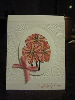
Last weekend my neice Gabrielle stayed the night with us. I promised her that we would be crafty and make a couple of cards. I pulled up my favorites list and let her choose two cards to case. Of course I told her that they wouldn't be exactly like the cards she found, but similar. The first one she picked can be found here. Here is my version:


I really like the different layers of white with different textures and the pop of pink in the center. The card base is Whisper White card stock. I embossed the lines at 1/2" from the top and bottom with my scorepal, then centered the embossing folder between my lines. The two ovals in the center were cut and embossed with Nestabilites ovals.

I stamped the flowers and stems from Fifth Avenue Floral in Black Stazon. Then I colored in the flowers with Pretty in Pink, Regal Rose, and Rose Red. The centers were colored with Blush Blossom and Summer Sun. The stem was colored with Garden Green and Handsome Hunter. The ribbon was from my stash. To finish it off I stamped "Wonderful" from Warm Words in Rose Red ink at the bottom.

The second card that Gabrielle chose to recreate can be found here. Here is my version:

I really love fall and all of the brown, yellow, gold, and red colors. This card really fits all of those colors into it. The card base is Very Vanilla with a Chocolate Chip mat under some misc photo paper with leaves on it. The next layer is Chocolate Chip and some Halloween Large Stripe (non SU) paper. The third layer, which is popped out, is from Chocolate Chip, Tangerine Tango, and Very Vanilla.

The small rectangle of Very Vanilla had the leaves from Lovely As A Tree stamped in Black Stazon and colored in with Creamy Caramel, Close to Cocoa, and Chocoltae Chip markers. I sponged So Saffron, Close to Cocoa, and Tangerine Tango on the corners of this piece. I added some brown with white polka dot ribbon from my stash, stamped "Cherish" from Baroque Motifs in Chocolate Chip, and added five dots of Copper Stickles to the corner of the Creamy Caramel card stock. I absolutely love this one! I would like to apologize for the dark photos. By the time I got around to taking pictures of the cards I made it was late and dark outside.

Saturday, October 10, 2009

Dark Blue Swarovski Pearl and Crystal Necklace


I made this necklace and earrings set specifically to wear with my formal dress on our vacation. It is the same design I used for my mother's set, but with a different color of pearls and a different pendant. The 8mm dark blue pearls were individually strung on eye pins and joined to make a chain. For the pendant and earrings I used a baroque teardop of AB clear crystal. All of the beads and findings were from Fire Mountain Gems. Below you can see different views of the necklace and earrings. This set went perfectly with my formal dress and crochet shawl as you can see in the last picture of my previous post.


I think I will be making one in the same design with different colors to put in my etsy store. I've had the store set up for a while, but now I think I'll actually have to list something on it. Humm...maybe after christmas presents are done.

Friday, October 9, 2009

Broomstick Lace Crochet Shawl - Finished!!!

A project finished and checked of the In-Process Project List! Yay! I found this fabulous pattern for a shawl in the Summer 2009 issue of Interweave Crochet. I got the yarn, beads, and a very large knitting needle that the instructions listed.


The yarn is from WEBS and the color is called Whipple Blue. One cone was more than enough for my fabulous shawl.


Then the beads were from Fire Mountain Gems. It was interesting getting used to crocheting around the very large knitting needle, not to mention holding the knitting needle while using the crochet hook. But it was well worth it. After finishing the edging and blocking it this is what I came up with and I absolutely love it! In the pictures below you can see different views of the completed shawl. At the end you can see a picture of my and my husband from the formal night of our cruise. I am wearing both this shawl and the jewelry that I will post about later. I am so pleased with how this project turned out!


Saturday, September 26, 2009

A Magical Vacation

We returned Saturday night September 19th from our absolutely fantastic Disney Cruise Line vacation. We had such a wonderful time being spoiled rotten all week with wonderful food, good fruity drinks, entertainment, and relaxation. The three course dinners were amazing and had a large variety at the three restaurants on board. The broadway style plays were spectacular with lighting and fireworks special effects. I would recommend anyone who wants to experience a truly magical vacation to look into the Disney Cruise Line vacations. Beleive it or not there were more families or couples without children then there were families with children. Even though you see the characters wandering around we never felt like this cruise was just for kids. We had so much fun that before we left the ship we booked another cruise for next year in October, which is why you see that the counter has been restarted.


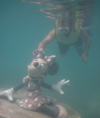
The photo above is of the Disney Magic which is the ship we were on for the week. There are endless activities and places to just relax. The ports we stopped at are Tortola, St. Thomas, and Disney's private island Castaway Cay. In Tortola we went on a scenic bus tour where I was able to get some beautiful photos of the islands. In St. Thomas we enjoyed snorkeling with wild sea turtles and schools of tropical fish. In Castaway Cay we enjoyed snorkeling again. The first photo you see is me with the statue of Mickey Mouse, and the second is with my husband posing with Minnie Mouse.


Thursday, September 10, 2009

Disney Cruise Vacation!!!!

You can see that my counter for the Disney Cruise Vacation is slowly but surely getting down to the last few hours. Early tomorrow morning I will be heading off to the airport for a wonderful 7 day cruise through the Eastern Caribbean. I will not be making any new posts until at least the 20th which is the day after my husband and I return home. This vacation has been two years in planning and almost my whole family is going (Mom and dad; sister, her husband and kids; brother in-law's dad and girlfriend, and my husband and I). I will also get to celebrate my birthday on the cruise. I will be sure to post some pictures upon my return and shortly after I will be able to work more on craftng. Have a wonderful week everyone!

Saturday, September 5, 2009

Swarovski pearl and crystal necklace

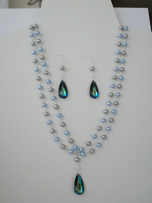
I made this set of jewelry for my mother as a thank you for helping me sew a dress for our very quickly upcoming cruise vacation. Yes... I of all people actually sewed a dress that is very close to being finished and actually turned out well. The necklace was made with light blue and light grey 8mm Swarovski crystal pearls that are each individually strung on an eye pin. They were then linked together in an alternating color pattern to form the two chains.
Here you can see the necklace with the matching earrings. For the pendant I used a Bermuda Blue teardrop that is a gorgeous dark blue green color. Below are close ups of the earrings and the pendant.
I am really pleased with ow this set turned out and made a similar one for myself that I will have to post later. Mom of course loved it because she picked out the pearl colors and the pendant to match the dress that she made (which look gorgeous) for the formal dinner night on our cruise. I will make sure to post a picture of both of us wearing our hand made dresses. What do you think?

Saturday, August 22, 2009

New Stampin' Up Demonstrator


I have recently signed up to be a new Stampin' Up demonstrator. I am looking forward to showing you how some of these great products and stamps can be used. There are links on the side of the page so you can view the curret catalogs, or travel to my Stampin' Up website where you can purchase some of these fantastic supplies. I have used stampin up since 2005 and have fallen in love with the stamp sets they offer and the color coordinating supplies like ink, paper, ribbon, and more. I hope you take a few minutes, if you haven't before, too look at the items they offer. There is something for everyone and their quality and service is impeccable!

Tuesday, August 11, 2009

A worthwhile cause


If you like to help others than here is a great cause that would take only a little of your time. On Jess's blog you will find a post requesting sympathy cards to be given to the spouses of soldiers that have passed away. Not to mention you could also wind some blog candy. This is a really great cause to support. I have begun digging through my boxes of cards that I have made in the past and pulled out all of my sympathy cards, and I plan on making more. Any little contribution helps. You can send as many or as few as you wish, but please check out Jess's blog.

Monday, August 3, 2009

Pay It Forward

I have heard of the kind of pay it forward where when someone does a nice deed for you, you do a similar nice deed for someone else and keep it going. I had not, until now, heard of a crafting version where you give people handmade items and keep it going in that way. I think this is an absolutely fabulous idea! What a great way to spread love of crafting and creativity with others. I first found out about this on Boni’s blog. I would like to take a part in sharing my creations with others. If you would like to play be one of the first five to leave a comment to this post and you will receive a one-of-a-kind handmade gift from me! So here are the rules:

1. The gift will be a mystery of my choice created just for you. I will e-mail you with a couple of questions so I know it will be something you like.
2. I will have one year from your post date to send out all five gifts. But it won’t take that long. Maybe a couple of months.
3. If you're one of the five, you must make a post in your blog offering to make a gift for five people, spreading the joy of creation.
4. When you receive your gift, you should make a post on your blog and show everyone inspiring others to follow the chain and participate.

If your interested play along! It will be fun to see what others come up with and receive. It’s such a wonderful thing to be able to share creativity and inspiration with others. The best part is the gift is a complete surprise! Join in on the fun and play “Pay It Forward”.

Sunday, July 26, 2009

In Color Medallion

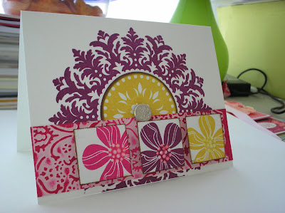
I created this card for the Splitcoaststampers sketch challenge #238 which can be found here. I just got my order yesterday which had all of the new In Color inks, paper, and markers, and also the fabulous Medallion stamp. Of course I had to use my newest toys, so both of my challenge cards this week use the new Stampin Up In Colors.

I stamped the medallion in Rich Razzleberry on Whisper White cs. I then stamped another medallion on another piece of Whisper White in Crushed Curry ink and cut out the circle. To cut out just the center circle I used the third from the smallest nestabilities die from the large standard circles set. I still had to trim some of the white around the center circle, but it saved the rest of the medallion so I can use it later instead of throwing it away. The Crushed Curry center circle was then sponged with Soft Suede ink and a brad was used to hold them together. The brad was from the Silver Hodgepodge Hardware set.

I used a piece of Pink Pirouette cs and ran it through a cuttlebug embossing folder and brayered the top with Melon Mambo ink. Three 1.25” squares were cut out of Whisper White and stamped with the flower from Eastern Blooms in Melon Mambo, Rich Razzleberry, and Crushed Curry. The edges of the squares were inked with Soft Suede using the direct to paper technique. The three squares are popped up using scrap rubber and I added some Diamond Stickles to the flower centers for some sparkle.


Happy Dandelions

I created this card for the Midnight Madness sketch challenge #11 which can be found here. I am so glad that I had the time to play with this sketch this week. I’ve wanted to use this Gina K. stamp set for a while now and finally got the chance. When this stamp set came out I really wanted it. I hadn’t bought Gina K. stamps before and realized that this one which is called Many Wishes was a free with three stamp set. So I purchased three other stamp sets just so I could get the Many Wishes set. Kinda crazy I know, but oh well I guess I’m just a stampaholic.

The first thing I did was cut a piece of Whisper White CS 3.25” square. This was then brayered with Crushed Curry, Melon Mambo, Dusty Durango, and then sponged a little with Rich Razzleberry. The stems and sentiment were stamped in Soft Suede and the flower heads were stamped in PTI’s Fresh Snow ink. The bottom edge was torn and then layered on a piece of Melon Mambo, which was also torn at the bottom. I then used some glue and some white flocking that I added Dazzling Diamonds glitter to and this was used to create the fluffly little ends of the dandelion. This adds just a little sparkle and texture.

The card base is Whisper White with Rich Razzleberry matted on it and some Raspberry Tart DSP. The main image panel that was matted on Melon Mambo is popped up with scrap rubber. I used some misc. white ribbon at the top with flower from the Flower Fusion Too set and some silver brads. What do you think?

Friday, July 24, 2009

Embossed Silhouettes

For this card I started with a Sage Shadow card. I then stamped the sentiment from SU’s Heard from the Heart in Chocolate Chip ink on some SU Dainty Dots dsp and added it to the card. With the scalloped ovals nestabilities I cut out one scalloped oval in Chocolate Chip and one smaller scalloped oval in Very Vanilla. I then cut out a standard oval in Very Vanilla that would fit on the scalloped Very Vanilla oval. The two scalloped ovals were adhered together and set aside. For the standard oval I embossed with clear embossing powder and Versamark two of the images from SU’s Pocket Silhouettes. After heat embossing these I sponged in the center with Bashful Blue ink and around the edge of the oval with Sage Shadow ink. This was then adhered to the other ovals. All of the ovals are popped up off the card using scrap rubber and a piece of misc. light blue ribbon was used to finish it off. What do you think?

Baroque Card Box

This is the fourth project that we created at my make and take. I used the tutorial for an A2 card box that can be found here.

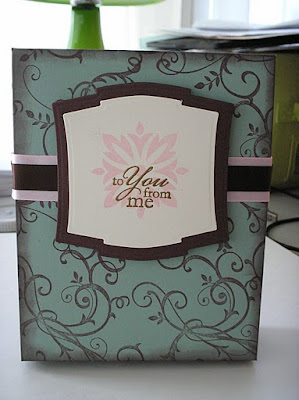
The bottom is made of Chocolate Chip cs and the top is Sage Shadow cs. The top was stamped in Chocolate Chip with the swirls from the SU set Baroque Motifs. I used the eyelet border punch on the edges of the box, and sponged the corners with more Chocolate chip ink. For the panel on top of the box I used Nestabilities Labels 2 dies in Chocolate Chip and Very Vanilla to cut and emboss the label shape. Pretty in Pink was stamped on the Very Vanilla cs using one of the motif stamps from the Baroque Motifs set. The sentiment, from the SU Best Yet set, was embossed with gold embossing powder over the pink motif. Some misc. pink ribbon and PTI Dark Chocolate ribbon were used to finish it off. It looks like this box will hold a lot of cards because the bottom is 1.5” deep.


Golden Daisies

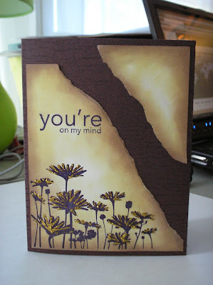
This is the third card that we made at my make and take. The inspiration was from a card that I had seen on Splitcoaststampers.com. Here.

It starts with a Chocolate Chip card which was stamped with the SU Weathered background stamp in Basic Black ink. A piece of Very Vanilla was then stamped with the daisies and sentiment from the SU set Upsy Daisy in Basic Black ink. The Very Vanilla was then torn at a diagonal across the middle. These two pieces were then sponged with So Saffron and Close to Cocoa all the way around the edges. Then I just added some Goldenrod stickles to some of the daisies. This was a simple and quick card to make that looks interesting. What do you think?

Bashful Butterfly

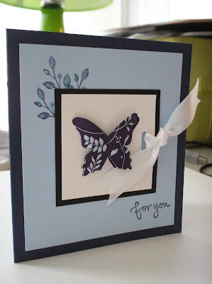
This is the second card that my mom, sister, and I made at our make and take. The inspiration came from this card that I saw on Splitcoaststampers.com: Here.

This card was started with a 4.25” x 4.25” card made from Night of Navy cs. I then added a piece of Bashful Blue that was 3.75” x 3.75” which leaves a wide border on all sides. The leaves and the sentiment were then stamped in Night of Navy ink on the Bashful Blue cs. All of the images used on this card are from the Great Friend SU stamp set. The butterfly was stamped twice, both on Whisper White cs. One piece was mounted on the Basic Black cs and then punched with the slot punch from SU. Some misc. white ribbon was threaded through the slot punch and tied around the side of the Whisper White and Basic Black stack. This was then adhered to the Bashful Blue cs. The other butterfly was colored in with a Bashful Blue marker and cut out. You can’t really tell in this picture, but the second butterfly is popped up on the first and the wings are curled. Then I just added some stardust stickles to the butterfly and the leaves. What do you think?

Thursday, July 23, 2009

Nestabilities Storage

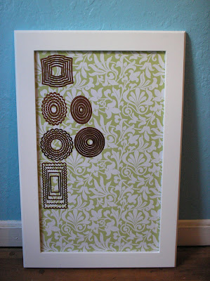
One afternoon I was doing chores and as usual my mind wandered to how I want my craft room to look when it’s finished and how I want some things on shelves out where I can see them and others in drawers. While using my nestabilities one night, which were still on the cards that they were purchased on, the adhesive came completely off of the card when I pulled off a die. That got me thinking of a better way to store these. I like some things to be stored so they are not only easy to get to, but also look interesting as a decoration in my room.

I had what I consider a scathingly brilliant idea for storing my dies. I asked by husband to make a picture frame for me in his wood shop with a ¼” plywood back for where the picture would normally go. I painted the picture frame white. On the ¼” plywood I glued down some magnet sheets with spray adhesive and trimmed them to fit the ¼” plywood. I then used some more spray adhesive to adhere some beautiful wrapping paper that I found in the Hallmark section at Wal-mart. This paper fits perfectly with my craft room colors which are teal, white, and lime green. The pattern is also a very elegant backdrop for my dies. Then I simply added my nestabilities in the order I wanted them displayed. Because the entire inside of the frame is a magnet sheet the dies will stick anywhere in any order.


Although I don’t have many sets right now, I have plenty of room to expand, and if I have to I can make another with a different paper in the back. I just love how this looks and how easy it is to see what dies I have and get to them. The inside opening of the frame is 16 in. x 27 in. My craft room isn't finished yet so I leaned my Nestabilities frame up against the wall in what used to be my craft room, which is now my husband's office. The color of the wall in the picture will be the color on the walls of my craft room when it gets finished. What do you think?

Tuesday, July 21, 2009

Watercolor Rose

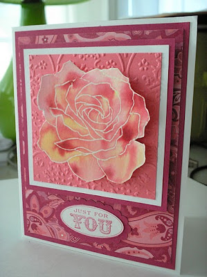
I know I haven’t posted in a while, but last week was not only a very busy week at work, it was also the end of the college semester. I was so busy between working overtime and finishing my last few assignments and test that I didn’t get a chance to play in the last few sketch challenges. I hope to be able to participate now though. Anyway, here is the first of the cards that we made at my Make and Take last week. The others I will post throughout the rest of the week.

This watercolor rose card was started by stamping the Fifth Avenue Floral rose on Shimmery White cs in Versamark and embossing in clear embossing powder. You then put the paper in a container and spray it with a misting bottle to saturate the paper. You then use an Aqua-painter and reinkers to color in the rose. With some practice, and 30 minutes drying time, you end up with a pretty water colored and shimmery image. This was mounted on Pretty in Pink cs that was run through a Cuttlebug embossing folder and mounted on Whisper White and Rose Red cs. The rose is popped up off of the three square layers and the square layers are popped off of the card using scrap rubber.

The card is Whisper White cs with Rose Red cs and Raspberry Tart dsp layered on it. The sentiment is from Oval All which was cut out and placed on a scalloped oval piece of Rose Red. This was cut using the SU’s scalloped oval punch. As usual all supplies are SU. I am really pleased with how this turned out. I’m not sure I want to give it away. What do you think?
Sunday, July 12, 2009

Sunrise Field (Cased)

I made this card for my husband’s birthday. I wanted to make him a really pretty scenic card so I browsed through my favorites and found a Zindorf tutorial for “Sunrise Field” which you can find here: http://zindorf.blogs.splitcoaststampers.com/2009/04/03/sunrise-field-tutorial-196/

I love Michelle Zindorf’s tutorials because they are so detailed and easy to follow. I started off sponging the sky using So Saffron, Barely Banana, Bashful Blue, Not Quite Navy, and Night of Navy. The ground hill in the background was created using a post-it-note and sponging more Not Quite Navy and Basic Black. The ground was created using a post-it-note to create the horizon and it was sponged with Close To Cocoa with a little black around the edges and underneath the hill. I used the spotted leaf stamp with Close to Cocoa and Basic Black to create the spots on the ground. The straight edged shadows on the field were created using a post-it-note mask and some Basic Black ink.

The trees were stamped in Basic Black and are from the Lovely as a Tree and Branch Out sets. Then the whole thing was sponged with Basic Black around the edges and the corners. This image was mounted on Very Vanilla, Certainly Celery, and Night of Navy. The sentiment is from the Elegant Greetings set and is embossed in gold embossing powder. The four gold brads in the corners of the main image finish it off. Mine turned out a little too dark. I think I was too heavy with my sponging. I will have to try again sometime to make it lighter. I’m please with how it turned out though. You have to check out Michelle Zindorf’s tutorials if you haven’t seen them. They are absolutely amazing and make it so easy that anyone can create these beautiful scenic cards.

Saturday, July 4, 2009

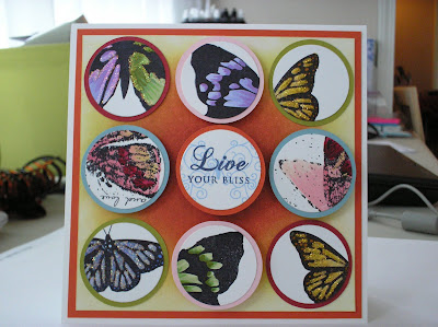
Sketch Challenge #235

This card I made for the Splitcoaststampers SC#235 which can be found here: http://www.splitcoaststampers.com/forums/showthread.php?t=445739

I started with a Whisper White card and a piece of Tangerine Tango on top of it. Then there is a piece of Whisper White that was sponged from the center out first with So Saffron the Pink Pirouette, then Kiwi Kiss, and finally Riding Hood Red. The circles were all from Whisper White cardstock that I stamped various butterfly images in Black Stazon. The butterflies were from the sets SU God’s Beauty, SU Measure of a Life, and Inkadinkado Garden Delight. I colored these in with SU markers in a variety of colors.

The white circles with the butterflies were cut out using the 1 ½” nestabilities die from the large circles. The larger circles I cut out of Baja Breeze, Kiwi Kiss, Tangerine Tango, Pink Pirouette, and Riding Hood Red cs using my Cricut with a 1 ½” shadow circle. The four butterflies in the corners I used stickles Diamonds glitter to highlight the butterflies. The other four outside circles are popped up with scrap rubber.

The center circle was stamped with PTI’s Butterfly Kisses in Bashful Blue. The sentiment is from PTI’s Mega Mixed Messages and was stamped in Night of Navy. This was popped up with double scrap rubber to make it stand higher than the others. I like the combination of all of the Spring/Summer In Colors here. I really need to order the new In Colors so I can play with them too. The card ended up being a huge 5 ½ inches square, but I wanted to make sure you could see a good portion of the butterflies. What do you think?

Friday, July 3, 2009

Midnight Madness #8

This card I made for the Midnight Madness Sketch Challenge #8 which can be found here: http://priscillastyles.blogspot.com/

I started off with a Going Grey card. I then stamped the flourish from Friends 24-7 on Whisper White cs in Baja Breeze and Close to Cocoa using the rock-n-roll technique. The stamp-a-ma-jig helped with the placement so I could make my own DSP. I then sponged the edges with Close to Cocoa. I used Going Grey and Basic Black cut with the largest nestabilities circle and scalloped circle dies, sponged the Going Grey piece with Close to Cocoa.
For the circles I use Kiwi Kiss that was run through the Bubbles cuttlebug embossing folder and then, like everything else, sponged the edges with Close to Cocoa.

The main image is the bird from Friends 24-7 that was stamped on Whisper White cs and colored with SU markers. I then sponged around the edge with Baja Breeze, Close to Cocoa, and Chocolate Chip. This is layered on Kiwi Kiss, Baja Breeze, and Whisper White all sponged around the edges with Close to Cocoa. This was added to the card popped up with some scrap rubber. I used some misc light blue ribbon and some misc lime green ribbon to finish it off. What do you think?

Monday, June 29, 2009

Midnight Madness Challenge #7

This card I made for the Midnight Madness sketch challenge #7 (which can be found here: http://priscillastyles.blogspot.com/). I started off with a Whisper White card matted with Sage Shadow. I used Perisian Breeze dsp matted on Not Quite Navy and Whisper White for the two smaller panels. For the oval I used the large oval nestabilities dies and cut the largest oval out of Whisper White. This was then sponged with Bashful Blue, Tempting Turquoise, Baja Breeze, and Night of Navy. For the Baja Breeze and Night of Navy I used reverse circle masks to make it look like rings on a pond.

I then embossed the entire oval with two coats of Glassy Glaze clear ep to make it look shiny like water. The butterfly and flowers were stamped in Black Stazon on Whisper White and colored in the SU markers. Five gold brads finished off the sketch in the upper left hand corner. I stamped “Cherish” from Warm Words in Night of Navy at the bottom corner and added a few dots of stickles for a little extra sparkle. Gold stickles was also added to the center of the flowers.


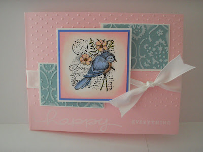
Sketch Challenge #234

I created this card for the SC234 sketch challenge (which can be found here: http://www.splitcoaststampers.com/forums/showthread.php?t=444498) on Splitcoaststampers.com. I started with a Pink Pirouette card that was partially embossed with Swiss Dots in the cuttlebug. At the bottom I stamped happy everything (from SU’s Happy Everything) in white craft ink at the bottom where I left out the texture. I matted some Baja Breeze cs that was also run through the cuttlebug onto Whisper White cs. I also ran a brayer with white craft ink over the embossing to make it stand out more.

For the center image I stamped the bird from Garden Collage in Black Stazon on Whisper White cs and colored it in with SU markers. This is matted on Ballet Blue and Whisper White cs. Some misc white ribbon really finishes it off. The only thing I would like different is for the stamping at the very bottom to stand out more. The white craft ink isn’t easily noticed on the light Pink Pirouette cardstock. But otherwise I am pleased with the result.


Friday, June 26, 2009

Father's Day Card

This is the card I made for my dad for Father’s Day. I started off with a Very Vanilla card cut 5” x 5” which I stamped with Weathered in Chocolate Chip to get the crackled look. For the main image I cut a 4” x 4” piece of Very Vanilla and sponged with Barely Banana, Bashful Blue, Baja Breeze, and Night of Navy to create the sky. I then masked off the sky portion so I could sponge the mountain in Close to Cocoa and Chocolate Chip. I stamped the tree from Nature Silhouettes in Black Stazon. I used the Stazon because it seems to be more of a true black then Basic Black which sometimes looks purple on lighter cardstock. I then used my Stamp-a-ma-jig to stamp the top of the three with the branches two more times to make the tree taller and half of the grass to go completely across the bottom of the cs. I then filled in the remainder around the edges by sponging Basic Black over and over until I got a true black.

After all this I covered the entire image with Versamark and embossed it with three coats of clear embossing powder to look glassy like you’re looking through a window. However, somehow there are some white speckles mixed in my clear embossing powder that you can see in the image. I will have to pick up a new container of clear embossing powder. I guess it just looks like you’re looking through a dirty window now, which would be the case in my house because I absolutely hate washing windows. Anyway, back to the card. I matted this main image on Chocolate Chip and Going Grey and then added four silver brads at the corners. The sentiment which is popped up with scrap rubber was stamped in Chocolate Chip on Very Vanilla cs from the Thinking of Father set. This is matted on Going Grey and Handsome Hunter with the corners punched with the ticket corner punch. Even with the white spots I really like how this card turned out.


Wednesday, June 24, 2009

Sketch Challenge #233

I created this card for the SC233 sketch challenge on Splitcoaststampers. You can find the link to the thread here: http://www.splitcoaststampers.com/forums/showthread.php?p=14448059#post14448059.

I started off with a Handsome Hunter card, then a piece of Very Vanilla was stamped with the swirls from Baroque Motifs and embossed in gold embossing powder. I used handsome hunter and real red to mat some pieces of Christmas patterned paper from a paper stack. I also used more Handsome Hunter to mat the Very Vanilla cs that was stamped with the cardinal from A Cardinal Christmas in Black Stazon and colored it in with SU markers. I then embossed it with clear embossing powder in three layers then I inked the edges of the cs with Versamark and added gold embossing powder. When heated it blends the edges of the gold with the clear. Then I used the cracked glass technique. Then just to finish it off I added some misc. red ribbon.

I’m not really thrilled with this one. I ended up running short on time and didn’t know what to do with this sketch and this card really was tossed together. It helps to go in with a plan before you start cutting when doing these challenges.

Midnight Madness SC#7

I created this card for the Midnight Madness sketch challenge #6. You can find the link to the Midnight Madness blog here: http://priscillastyles.blogspot.com/.
I started with a Whisper White card, with Dainty Dots DSP matted with Kiwi Kiss. Then I cut and embossed strips of Perfect Plum, Kiwi Kiss, So Saffron, and Bashful Blue with silver embossing powder and the swirls from Baroque Motifs. These are attached and Very Vanilla brads are used at the corners. The image from Garden Collage was stamped in Black Stazon on Whisper White cs and colored with SU markers. This was then sponged with So Saffron around the edges and matted on a piece of Perfect Plum. The sentiment is stamped in Perfect Plum on Very Vanilla cs and is matted on Going Grey. Both of the pieces of cs for the sentiment were punched with the ticket corner punch. I don’t remember what set the sentiment came from.

I love how the main image turned out on this card, but I’m not sure about the rest. It seems a bit busy for my usual style. It all seems to work together though. Another challenge completed and now on to next weeks! I do think I will keep it down to two weekly challenges and no more because it’s hard to find time to create especially since I have to take over the dining room table when I do.

Tuesday, June 23, 2009

One of a kind jewelry

I just recently bought the unique necklace pictured below which I absolutely love. The artist that created this wonderful piece of jewelry has a store on Etsy that you can find here: http://www.etsy.com/shop.php?user_id=5393842. The title of this one was "Once Upon a Time MoonShadow". A vintage watch movement is used for the backdrop which makes the necklace unique and interesting. There are many other styles of jewelry that you have to check out!

Thursday, June 18, 2009

Tri-Fold Shutter Card

Here is the last card that we made at our Make-and-Take. We made a Tri-Fold Shutter card. I have seen several of these on splitcoaststampers.com recently and really wanted to try it. It seems like a great card to showcase a pack of DSP and different techniques because there are so many panels and it looks so interesting. I found a tutorial for this card here: http://craftiblog.wordpress.com/2009/04/23/2009-04-23-quad-fold-card-sample-tutorial/


For the card I used SU Sage Shadow cs and the patterned paper is all SU Dainty Dots dsp. I used the SU sets Pocket Silhouettes and Great Friend for all of the images. The inks I used are Kiwi Kiss, Not Quite Navy, and Night of Navy. The other cs that was used is Very Vanilla (both sentiments), So Saffron (long middle panels), and Basic Black (both ends and middle). For the back panel I ran the dsp through a cuttlebug embossing folder and then took sandpaper and sanded off the top portion of the raised image. I love how the white of the paper shows through with the dark color on the background. It gives a shabby chic look to it. Some misc. lime green ribbon was tied on the bottom portion of the front panel and the butterfly from Great Friend was stamped in Kiwi Kiss and cut out. A vanilla brad holds it to the front panel and gold stickles highlight the leaf pattern in the butterfly. This card took a lot of time and a lot of pieces of paper, but it was well worth the effort!

The fourth project was the corner bookmark that I posted earlier. Now I just have to start preparing for the next month’s Make and Take. To get everything ready for this one I was up until 1AM on the Saturday night before getting all of the pieces cut and getting all the supplies together.

Wednesday, June 17, 2009

Sketch Challenge #232

I created this card for the SC 232 sketch challenge. I know this is a little late, but better late than never I guess.

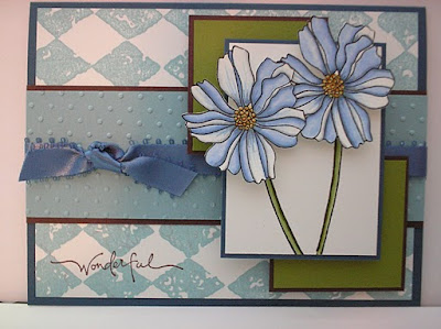
The card is SU Not Quite Navy cs. The Whisper White cs mounted on the Not Quite Navy card is stamped with SU Print Pattern in Baja Breeze. I used some Baja Breeze cs in the center that was embossed with a Cuttlebug embossing folder and then mounted on Chocolate Chip cs. I found some misc. bark blue ribbon that fits very well with this color combo and added it to the Baja Breeze and Chocolate Chip piece. For the two squares behind the main image I used Kiwi Kiss mounted on more Chocolate Chip which was then mounted to the card with some scrap rubber to make them stand out.
The main image is Whisper White cs stamped with SU Fifth Avenue Floral. The stems are stamped on a piece of white that is mounted on Not Quite Navy and colored in with SU markers (Certainly Celery, Old Olive). The flowers were stamped on Whisper White, colored in with SU markers (Bashful Blue, Brocade Blue, Going Grey, So Saffron, and More Mustard). The flowers were then cut out and added to the card with some scrap rubber to make them stand out. I then used the word “wonderful” from the SU Warm Words set stamped in Chocolate Chip in the lower left hand corner to finish it off.

I’m really pleased with how the colored flowers turned out. You can see a close up of them below.

Monday, June 15, 2009

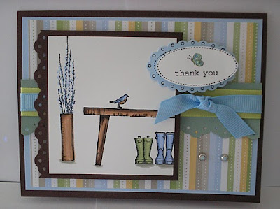
Scene In A Garden

This is the second card that we made at our make and take. Mom recently bought the SU Scene in a Garden stamp set so I had to use it for a card. You always have to play with your new toys when you get them. I cased this card http://www.splitcoaststampers.com/gallery/photo/1337254 .

I used Chocolate Chip CS for the card with bashful blue. The striped paper is from the SU Dainty Dots DSP. Sage Shadow CS was punched with the eyelet border punch and then some misc. lime green and light blue ribbon was added. More Chocolate Chip was used behind the main image and was also punched with the eyelet border punch. I have to say I really LOVE this punch and seem to use it a lot. I stamped the images in black Stazon on Whisper White CS and colored them in with Stampin Up markers (close to cocoa, chocolate chip, bashful blue, ballet blue, certainly celery, and sage shadow. The thank you sentiment was stamped from SU’s Oval All once on Bashful Blue CS and once on Whisper White CS. The bashful blue wash punched with SU’s scalloped oval punch and the white was cut out with scissors. I colored in the butterfly and added some stickles on the wings. The two silver brads fill in some blank space on the bottom right corner.
I really like how versatile this stamp set is. You can arrange and use any number of layouts with all of the cute images like the stack of pots and the windmill.