Monday, January 30, 2012

Craft Project Central!

Here are the last two fabulous projects for January!


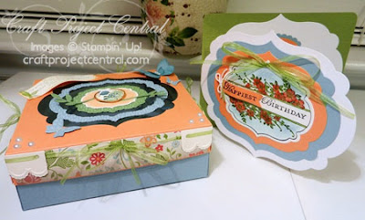
Bursting with Spring Gift Box and Card:

Sometimes you need a really special gift box for a really special person! Here is a pretty one that you can use! With its generous size and decorative top, you will be just as pleased to present this box as you are with whatever you choose to place inside. The recipient of this "bursting with Spring" gift box will surely consider it a keeper. The coordinating greeting card is the perfect accompaniment with plenty of visual interest on its own!


This project was created by Regina!


Gumball Necklace, Box, and Card:

Remember when you were a kid and used to get the little candy necklaces?! I remember putting mine on (usually at a birthday party), taking little nibbles out of it, and trying to make it last as long as I could. Here’s a fun project that your birthday girl (or boy) will love and will probably remember when they grow up too! Makes a cute little party favor too!


This project was created by Heidi!


To subscribe to the month of January on Craft Project Central click HERE!

Thanks for stopping by!

Thursday, January 26, 2012

Blog Critique!

I recently signed up for a Blog Critique over at Truly Lovely to get some insight into other's opinions about my blog. This was very interesting! As I was going through answering the questions (which you can find HERE) I realized a couple of things I should add such as the quick share buttons for facebook, twitter, etc and to add some more personal information.

The lovely ladies providing my critique were Kimberly at Lush Lounge and Vikki at The Quirky Quail.

It was very nice getting to read someone else's opinion of my blog and get some tips on how to make it more visually appealing and possibly more functional.


Here are some of the fabulous things I've learned...

  • Having the "search this site" and "follow by email" options right at the top are a plus! Makes it easy to find and use!
  • One of the ladies let me know that one of the things she does not care for is the fact that most of the projects require specific items from Stampin' Up. She would like to see some of the posts where generic items might be substituted.
    • Unfortunately this is not something I can change. I do sell Stampin' Up products and I am trying to promote them and show different ways that they can be used. I could, however, start a feature once and a while showing how I created a card similar to another one but with Stampin' Up products. It's kind of a reverse of her suggestion. What do you think? Should I do this sometime?
  • My blog is easy to navigate and user friendly!
    • Yay! I'm so glad to hear that!
  • PR Disclosure, she didn't see one
    • It's actually wayyyyyyy down at the bottom.
  • Facebook page isn't up to date. Last post was in November (Yikes!)
    • Yeah, I need to do better at linking new posts to my Facebook page. But the quick share links at the bottom of the post sure will make that faster and easier for me to do!
  • Add a few more steps in the tutorials...(Butterfly Wall Art)
    • Yeah, I missed getting every step-by-step picture on this one, but I was really hurrying to get it finished on time. I think for the most part my tutorials are thurough. I haven't received any questions on them. Please let me know what you think!
  • Try to incorporate some of the color from the header and background into the side bar more.
    • Done! I changed the catalog buttons from pictures of the catalog to a cute little button that I created in MDS! I really like this change! Not to mention I won't have to update the picture every time the catalog changes, just the link.
  • Add a little "About Me" section on the side bar so readers can meet the crafter behind the blog.
    • Done! I even added a picture. I personally find it nice to see a picture of the blogger in the side bar. I don't know why I didn't add one sooner. The "About Me" page has been updated too!
  • She really liked the part at the end of my Enchanting Thank You post where I mentioned one thing I really liked about the card. It adds a personal touch.
    • I will definitely try to do this more often! It's not easy for me, but I will try.
  • She suggested I ask my readers opinions on the projects more often or link to my shop.
    • I will definitely be working that in more. I so love to read all of the wonderful comments I get and get your opinon!
  • Post divider image....
    • I've seen other blogs with this and it looks wonderful. I would love to add one, but don't know how. If you know to add one of these please e-mail me some tips so I can add one!
  • Bullet list supplies line and try to break up the paragraphs a bit.
    • I have been using a bullet list for the supplies and I will try to break up the paragraphs so it is easier to read through.
  • Blog footer....nothing there, but thats not bad
    • I decided to move my "create" definition from the side bar, where it didn't really stand out, and change it to a picture that fits the same theme as the header and background. It's in the footer all the way at the bottom. Also, anyone know how to change the color of the bottom box? I really would prefer it to be white instead of grey, but I can't figure out how to change it.
  • Add more personal flair!
    • I will try to make it more personal. It's not easy for me since I don't know if my readers care to hear about personal stuff or would rather just look at the projects. I'm not good at jokes so I just stumped as to what to do.
Are there any other suggestions that you have? I would love to hear them! I really want to make my blog easy to use/read and make is something you enjoy looking at!

Do you want to see more "other crafts" than just cards? Should I try to work in some scrapbook pages? Is there anything specific that you would like to see or learn more about? Please let me know!

Thank you Truly Lovely for putting this Blog Critique together, adn thank you Vikki and Kimberly for your wonderful thoughts and suggestions! This has been a truly enlightening process!

Thanks for stopping by!

Wednesday, January 25, 2012

Crochet Dainty Ruffles Party Dress

This is another Christmas gift that I made! These pretty 18 in. doll dresses were for two of my nieces. Although they received them a little bit after Christmas because all those little ruffles took a lot longer than I thought they would! Here is the first one:  


And here is the second one:


You can purchase the pattern for a small fee by following THIS link.

Thanks for stopping by!


Tuesday, January 24, 2012

Flirtatious Wisteria

Here is another card that I created based on a sketch challenge from Stampin' Connection. This one is a pocket card! Instead of opening up like a regular card you just write your message on the label inside the pocket! Take a look:


  • Stamps: Posy Punch, Tagtastic, Precious Butterflies
  • Card Stock: Wisteria Wonder, Whisper White, So Saffron
  • DSP: Flirtatious
  • Ink: So Saffron, Wisteria Wonder
  • Accessories: Top Note Die, Paper Snips, Curly Label Punch, Rhinestones, XL Flower Punch, Stampin' Dimensionals, Summer Sun brad (retired), Sticky Strip
Here is the sketch that was created by yours truly:


 To make this card I started off by cutting two pieces of Wisteria Wonder card stock 4-1/4" x 11" and scored both of them at 5-1/2". To cut the diagonal line just position the card stock with the point of one corner and the edge of the scored line on the opposite side lined up with the cutting blade on your paper cutter. Then cut. Repeat with the other piece of card stock. Now just adhere the 4-1/4" x 5-1/2" sections on top of one another so that the rectangles are on the bottom of the card.

Now to cut the DSP so that it fits. Cut a piece of Flirtatious DSP 3-7/8" x 5-1/8". Then line up the opposite corners with your cutting blade to cut the angle. Adhere the DSP onto each of the triangles. Place sticky strip on the bottom of the rectangles and adhere to the card base to create the pocket.

For the label in the pocket I cut a piece of Whisper White card stock and a piece of So Saffron card stock 4" x 5" and ran both through the Big Shot on the Top Note Die. Using Paper Snips I trimmed around the Whisper White top not along the stitched line the die created. I adhered the Whisper White top note onto the So Saffron Top note.

For the embellishment I stamped the flower from Posy Punch onto a scrap of Whisper White card stock in Wisteria Wonder ink. The flower was punched out with the XL Flower Punch. I used the flower punch again on a scrap of So Saffron card stock. Then I used my Paper Piercer and Mat Pack to pierce a hole through the center of both flowers. A Summer Sun corduroy brad was inserted through the holes and the prongs of the brad were spread on the back of the So Saffron flower. Stampin' Dimensionals were used to adhere the flower onto the top note.


Finally the label from Tagtastic was stamped onto a scrap of Whisper White card stock in So Saffron ink. The greeting from Precious Butterflies was stamped in Wisteria Wonder ink in the center of the label. This was punched out with the Curly Label punch. A rhinestone was added onto the greeting just to give it a little sparkle, and the label was adhered onto the card front with Stampin' Dimensionals.


Although it looks complicated it really isn't difficult to create a pocket card. The flower on the label is just a fun embellishment. Have you ever made a pocket card? Or any other fun fold card?

Thanks for stopping by!


Monday, January 23, 2012

Enchanting Watercolor Painting

Here is a fun card I created for the SCCSC101 Sketch Challenge on Stampin' Connection. Take a look:

  • Stamps: Fresh Vintage, Field Flowers
  • Card Stock: Pool Party, Whisper White, Soft Suede
  • DSP: Everyday Enchantment
  • Ink: Pool Party, Soft Suede
  • Markers: Calypso Coral, Lucky Limeade
  • Accessories: Aqua Painter, Pool Party Re-inker, Shampagne Shimmer Paint, Sponge Dauber, Designer Frames embossing folder, Paper Snips, Crystal Effects, Adorning Accents Edgelits, Adorning Accents Embossing Folder, Two-Way Glue Pen, Modern Label Punch, 3/4" x 15/16" Oval Punch, misting spray bottle, Stampin' Dimensionals
Here is the sketch that was created by Susie Nelson:


The card base is Pool Party card stock cut at 4-1/4" x 11" and was scored along the 11" side at 2" and 7-1/2". Next I cut a piece of Whisper White card stock 3-1/2" x 4". I ran this through the Big Shot with the Adorning Accents Edgelits die to cut the decorative edge. I stamped the image from Fresh Vintage in Pool Party ink all over the Whisper White card stock to create a background pattern.

This was then adhered onto a piece of Pool Party card stock that was cut at 4" x 4 1/4". Then I ran this through the Big Shot with the Adorning Accents Edgelit again to cut a matching decorative edge onto the Pool Party card stock. Then I ran it through the Big Shot again with the Adorning Accents embossing folder to add the embossed detail that matches the cut edge. This panel was adhered onto the 2" flap on the card base.

A piece of Everyday Enchantment DSP was cut at 3-1/2" x 4-1/4" and was adhered onto the 3-1/2" long flap on the card base.

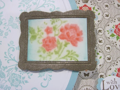
Now for the picture frame... ran a scrap of Soft Suede card stock through the Big Shot in the Designer Frames embossing folder and I cut out around the edge of the frame with Paper Snips. Next I used a Sponge Dauber with Champagne Shimmer Paint to paint the picture frame and give it a metallic sparkle. Then I cut a piece of Whisper White card stock 1-3/8" x 2".

The flower image from Fresh Vintage was colored in with Calypso Coral and Lucky Limeade markers directly onto the stamp. After I finished coloring the image on the stamp I sprayed the stamp with water in a fine misting spray bottle, then I stamped the image onto the small piece of Whisper White card stock. I don't know what this technique is called, but I like to call it the Faux Watercolor Technique because the stamped image looks like it was watercolored.


Then I put a single drop of Pool Party re-inker onto a scrap of plastic and picked up just a little bit of color on my Aqua Painter to color the area around the flowers a soft blue. After the card stock dried completely I adhered the small cardstock watercolor painting into the picture frame. Then I covered the image completely with Crystal Effects. This made the colors in the image even softer and look even more like watercolor. Not to mention it made it look like a piece of art behind glass in my litte paper frame.

The frame was adhered onto the Whisper White/Pool Party flap with Stampin' Dimensionals.


The greeting from Field Flowers was stamped onto a scrap of Whisper White card stock in Soft Suede ink and was punched out with the 3/4" x 15/16" Oval Punch. Next I used the Modern Label punch on a scrap of Pool Party card stock. I cut the length of the modern label down with Paper Snips and adhered the ends behind the greeting oval with the Two Way Glue Pen. The greeting was adhered onto the DSP flap of the card front with a Stampin' Dimensional.

I really had a great time playing around with making the "artwork" really look like a watercolor painting! I also absolutely love the Everyday Enchantment DSP with Pool Party! So much fun! Have you been trying any fun techniques lately?

Thanks for stopping by!

Wednesday, January 18, 2012

Enchanting Thank You

This card was created for SCCSC98 on Stampin' Connection. More Sale-A-Bration goodies used on this one! Take a look:


Stamps: Curly Cute, Fresh Vintage (SAB)
Card Stock: Soft Suede, Very Vanilla
DSP: Everyday Enchantment (SAB), Silver Glimmer Paper
Ink: Crumb Cake, Soft Suede, Early Espresso
Accessories: Stampin' Sponge

Here is the sketch that was created by Liz Goldhawk:


This card was so easy and quick to put together! For the card base I used Soft Suede card stock cut at 5-1/2" x 8-1/2" and was scored at 4-1/4". Two pieces of Everyday Enchantment DSP (SAB) were cut at 1" x 5-1/4". The edges were sponged with Soft Suede ink. A piece of Very Vanilla card stock was cut at 2" x 5-1/4". The floral image from Fresh Vintage was stamped all over the Very Vanilla card stock in Crumb Cake ink to create a background pattern. The greeting from Curly Cute was stamped onto the right side of the card stock in Early Epsresso ink. The edges of the card stock were sponged with Soft Suede ink.

The DSP strips and stamped Very Vanilla card stock were adhered onto the card front. A piece of Silver Glimmer Paper was cut at 1/4" x 4-1/4" and was adhered vertically on the left side of the card. That's it!


I just love the vintage look of the sponged DSP and the sparkle from the strip of glimmer paper!

Thanks for stopping by!

Apothecary Art Birthday

Today I have a card for you that I created using the SCCSC99 sketch on Stampin' Connection. I've been having lots of fun playing with the new toys I've gotten from the Occasions Mini and I just LOVE the Everyday Enchantment DSP that you will be able to get for FREE with a $50 during Sale-A-Bration which begins January 24th! Take a look:


Stamps: Apothecary Art
Card Stock: Pool Party, Whisper White, Poppy Parade
DSP: Everyday Enchantment
Ink: Black Stazon, Basic Black
Markers: Calypso Coral, Poppy Parade, Lucky Limeade, Always Artichoke, Pool Party
Accessories: Labels Framelits, Paper Snips, Pool Party Ruffled Ribbon, Stampin' Dimensionals, White Gel Pen

Here is the sketch that was created by yours truly:


The card base is Pool Party card stock cut at 5-1/2" x 8-1/2" and scored at 4-1/4". Next I cut a piece of the wonderful Everyday Enchantment DSP to 3-7/8" x 5-1/8" and adhere it onto a piece of Whisper White cardstock that was cut at 4" x 5-1/4". This was adhered onto the card front.

Then I used my Labels Framelits to cut the larger label from Poppy Parade card stock. Then I stamped the image from Apothecary Art onto a scrap of Whisper White card stock and cut out the image with the smaller Label Framelit. I colored in the stamped image with the Calypso Coral, Poppy Parade, Lucky Limeade, Always Artichoke, and Pool Party markers. I tried to add some white dots to the flower centers with my White Gel Pen, but it needs to have the tip cleaned so I just left it as it was. The stamped label was adhered onto the Poppy Parade label. The label layer was adhered onto the card front with Stampin' Dimensionals.

I cut a strip of Pool Party card stock 1/2" x 4" and stamped the greeting in Basic Black ink. I cut the ends into a dove-tail with my Paper Snips and adhered the greeting onto the label with Stampin' Dimensionals.


To finish off the card I used my Hobby Blade to cut a slit in the fold of the card and ran some Ruffled Pool Party ribbon through the slit, around the card, and tied it into a bow. So simple and easy!

Thanks for stopping by!

Tuesday, January 10, 2012

Telescoping Snowman

I have seen so many of these across the internet lately and they are just adorable! Besides the fact that I just love snowmen! I knew I wanted to have this be the 3D project for the December make and take! So here it is!


Stamps: Serene Snowflakes, Snow Swirled
Card Stock: Whisper White, Bashful Blue, Night of Navy, Basic Black, Pumpkin Pie
DSP: Real Red Glimmer Paper
Ink: Bashful Blue, Night of Navy, Whisper White Craft, Pink Pirouette
Accessories: Petite Pennants punch, ½” Circle punch, Northern Frost die, Paper Piercer, Mat Pack, Word Window Punch, Corner Rounder punch, Large Scalloped Circle die, 3-1/2” Circle die, 3” Circle die, 2-1/2” Circle punch, Stampin’ Sponge, Two-Way Glue Pen, White Gel Pen, Pumpkin Pie marker, Basic Black marker, Stampin’ Sponge, Silver Brads, Sticky Strip.

One piece of Basic Black card stock was cut at 4-3/4” x 4-3/4” and was run through the Big Shot on the Large Scalloped Circle die. One piece of Night of Navy card stock and one piece of Whisper White card stock were cut at 3-3/4” x 3-3/4” and were run through the Big Shot on the 3-1/2” Circle die. One piece of Bashful Blue card stock and one piece of Whisper White card stock were cut at 3-1/4” x 3-1/4” and were run through the Big Shot on the 3” Circle die. The 2-1/2” Circle punch was used on a scrap of Whisper White card stock.

Using the medium and large Whisper White circles stamp the snowflake images from Serene Snowflakes all over the card stock in Bashful Blue ink to create a background pattern. Stamp the “Seasons Greetings” from Snow Swirled in the center of the middle Whisper White circle. Stamp the sentiment from Snow Swirled in the center of the larger Whisper White circle.

The edges of the Basic Black scalloped circle were sponged with Whisper White craft ink. Then the large Whisper White circle was adhered on top of the large Basic Black scalloped circle. Next the medium Whisper White circle was adhered onto the Night of Navy circle. Then the small Whisper White circle was adhered onto the Bashful Blue circle.

Here is where it may sound a little confusing. Place the largest circle with the stamped text right side up on top of the Mat Pack with the top of the circle on the mat. Now place the middle circle layer on top of the bottom layer, but make sure this one has the text upside down. You want the middle circle centered on the larger circle. Now pierce a hole through the top of the circles so the hole goes through both layers. Insert a silver brad and spread the prongs on the back of the Basic Black card stock.

Now turn the middle circle so the writing is right side up and the circle is above the bottom one. Now does it make sense why the writing had to be upside down? Now center the smallest circle on top of the middle circle and pierce another hole through the top of the circles and insert a silver brad. Rotate this circle out so you now have three circles that look like they are stacked on top of one another. See the snowman taking shape?

Use the ½” Circle punch with Basic Black cardstock to create the eyes. Adhere onto the small Whisper White circle with the Two-Way Glue Pen. Use a Stampin’ Sponge with Pink Pirouette ink to give the snowman some rosy cheeks. To create the mouth use the Petite Pennants punch on a scrap of Pumpkin Pie card stock. Now use paper snips to cut the straight sided triangle in half and round the corners on the wider end of the half of the triangle. Add some carrot lines with the Pumpkin Pie marker and adhere the nose onto the snowman with the Two-Way Glue pen. Use the fine point end of the Basic Black marker to create the smile. Now just use the White Gel Pen to add some glimmer to the eyes.


Now for the hat! Cut a square of Basic Black card stock 1-1/4” x 1-1/4”. Use the Corner Rounder punch on two of the corners. Use the Word Window punch on a scrap of Basic Black card stock. Sponge the edges of both pieces with Whisper White Craft ink and adhere the word window punch onto the bottom of the square. A short strip of Real Red Glimmer Paper was cut ¼” wide and adhered onto the hat to create a band. The ends were trimmed to match the edges of the hat.

Then a scrap piece of Whisper White card stock was run through the Big Shot on the Northern Frost strip die to cut out the smallest snowflake. Use the Paper Piercer and Mat Pack to pierce a hole through the center of the snowflake and the hat. Insert a Silver brad into the hole and spread the prongs on the back of the hat. Adhere the hat onto the snowman’s head with Sticky strip placed just at the bottom of the hat. When your opening this snowman you will be pulling on the hat so you want it to be adhered good and strong.


Now your telescoping snowman is complete! When he’s closed up he will just barely fit inside a standard A2 envelope. This guy required a lot of die cutting and paper piercing, but he’s totally worth it!

Thanks for stopping by!

Butterfly Wall Art

This is just one of the many gifts that I made for Christmas 2011. I really like to give handmade gifts because I think they are a lot more personal. However, they take time which is why I was so behind on posting everything else, especially the week before Christmas. This year my goal is to start on Christmas presents right away so maybe I can actually relax and enjoy the holiday season more instead of working my butt off to get the gifts finished.

I got the inspiration for this project from Pinterest (the best website ever!). You can follow me on pinterest by clicking the button in my right sidebar. The inspiration piece was created by Gayle Wheeler and you can find her project HERE. I wanted to make mine much larger to fit the pretty frame I found at a garage sale. So here it is...with a tutorial too!


Card Stock: Whisper White, Pool Party, Tempting Turquoise, Pretty in Pink, Pink Pirouette, Melon Mambo
Not SU: electronic cutter, Home Decor Solutions Cartridge, 12" x 24" vinyl, 12" x 24" transfer paper, turquoise glitter glue, acrylic paint Apple Barrel Cloudless and Carribbean, floating medium, paint brush, plastic cup, painter's tape, packing paper, Krylon Glitter Blast in Diamond Dust, Sparlke Modge Podge, matte finish Modge Podge, carbon paper, printer paper, scissors, tape.
SU: stylus, Beautiful Butterflies die, Beautiful Wings sizzlit, Big Shot, Basic Rhinestones (two packages), Mini Glue Dots, Crystal Effects
Embossing folders: Perfect Polka Dots, Petals-a-Plenty, Elegant Lines, Manhattan Flower, Vintage Wallpaper, Snow Burst, Square Lattice, Flower Garden, Final Press, Elegant Bouquet

I found the frame at a garage sale for $5. It had a mirror in it and the most horrible gold paint. Sorry, I forgot to take a before pic. I painted the frame with white spray paint and sealed it with a layer of Sparkle Modge Podge that I already had. You can't really tell in the pictures but the white frame really sparkles.

My Sister loves sparkles and bling so I wanted to make sure this project had lots of bling!

1. My husband cut a piece of 1/4" thick plywood to the size needed to fit in the frame. I started off by painting the plywood with some leftover white house paint. It took three coats to get a good solid coverage.


2. I used Apple Barrel brand acrylic paint in the colors Cloudless and Carribbean. These were just the ones that looked "right" when I was browsing the paint section at the craft store. I also used Folk Art Floating Medium, it doesn't matter what brand, but it's a clear gel that kind of thins down the paint to make it easier to blend without making it runny; clear plastic cups and a cheap paint brush.


3. The ombre look really wasn't that hard to get. I started off painting the bottom third of the panel with just Carribbean paint, the middle section was just Cloudless paint. For the top I added a good squirt of Floating Medium into the Cloudless paint and used that to blend the middle color into the white. Then just to blend it all together really well I took the brush, still wet with Floating Medium/Cloudless paint, and starting from the top working my way all the way down I just brushed back and fourth. You can see the brush strokes in the paint, but it blended the colors together really well. Allow this to dry for 24 hours.


4. I wanted some type of text to be in the background so I used my Microsoft Word and chose a font and size that I liked and printed out all the words. I cut the words into strips and taped them together as necessary to make them fit within the width of the plywood. I taped one end down with painter's tape just to hold the paper in place. Then I lifted up the printed text and placed carbon paper underneath. I used my stylus from the Simply Scored to trace the letters and transfer them onto the plywood.


Here is what the text says:

Create: To produce through artistic or imaginative effort. Create and inspire. To make your own.

Inspire To cause or create new ideas. Fresh thought; to influence. To motivate one to action.

Share: To participate in, use, enjoy, or experience jointly or in turns. To enjoy with others.

Creativity: The ability to transcend traditional ideas, rules, patterns and relationships to create meaningful new ideas; originality or imagination.

Note: I had written over the carbon lines with a turquoise sharpie because I was afraid that the glitter glue would not cover completely. You don't have to worry about this. As long as your using a colored glitter glue  your text lines will be completely covered and you won't be able to see them.

5. I used my electronic cutter with the Home Decor Solutions Cartridge. I already had a package of vinyl that was 12" x 24". I used the 12" x 24" mat with the vinyl to cut out the swirl image as large as I could. Enter in the page size (12" x 24") and select Fit to Page. This gave me the largest possible image. Once the image was finished cutting instead of removing the outside of the image I removed the image itself. I wanted the negative to use as a mask. Then I used Transfer paper to remove the vinyl from the cutting mat and placed it onto the plywood at and angle. I repeat the steps to cut another image. This only took two 12" x 24" sheets of vinyl and two 12" x 14" pieces of transfer paper.

After both images were on the plywood I covered the remainder of the plywood with brown packing paper and painter's tape. I wanted only my swirl image exposed. Then I took the plywood outside and sprayed it with Krylon Glitter Blast spray paint in Diamond Dust. This was a clear irridescent sparkle, but they have lots of colors too. I wanted this to be just a subtle glittery swirl so I used the clear irridescent. Once the paint was allowed to dry for about 5 minutes or so I removed the vinyl, painter's tape, and packing paper. Then I allowed this to dry overnight.


Here is what it looked like at this point. I really LOVE the glittery swirls! I have so many ideas of other ways to use this fabulous spray paint!


6. Next I used turquoise glitter glue (not SU) to write over the text to make the text sparkly. After the glitter glue was allowed to dry overnight I coated the entire thing in clear matte finish Modge Podge just to seal everything in. This was allowed to dry overnight.

7. I put the plywood into the frame and used a household silicone seal around the edge of the plywood so it stays put in the frame. Again, allow the silicone to dry overnight.


8. Then I used pieces of Tempting Turquoise, Pool Party, Whisper White, Pink Pirouette, Pretty in Pink, and Melon Mambo cardstock with the Beautiful Butterflies die and the Beautiful Wings sizzlit with my Big Shot to cut out all of the butterflies. Then a variety of SU embossing folders were used to add texture: Perfect Polka Dots, Petals-a-Plenty, Elegant Lines, Manhattan Flower, Vintage Wallpaper, Snow Burst, Square Lattice, Flower Garden, Final Press, Elegant Bouquet. The butterflies were folded up a little and the wings were curved with a bone folder to give them some shape. The smaller ones were just folded up at the center.

9. To attach the butterflies onto the plywood I put a Mini Glue Dot onto the butterfly, but I also put a little Crystal Effects. The glue dot to hold it in place right away, but the Crystal Effects to hold it there forever. I don't know if they would have fallen off eventually, but we have pretty high humidity here in Kansas in the summer and I at least wanted to try to make it last a long time. The small butteflies were adhered just with Crystal Effects.

10. After all of the butteflies were added I added Basic Rhinestones to make the body of every...single...buttefly. This took about an hour to do, which I was doing Christmas morning while we were waiting for everyone to arrive. Yeah, I barely got this one done in time. 


I've noticed on some of my other projects that after a while some of the rhinestones my fall off of the project. I didn't want this happening on this wall art and Crystal Effects is some really tough stuff when it dries. So, to make sure non of the rhinestones fall off I put a line of Crystal Effects ever the rhinestones just to make sure they stay in place forever. This was allowed to dry and the project was done....Finally!

You can really see how the frame glitters in this photo:


Here is another look at the finished project!


This certainly took a lot of drying time between the various layers, but I really love how it turned out! I might make a smaller version for myself.

Thanks for stopping by!

My Friend

This card was created for the SCCSC91 Sketch Challenge on Stampin’ Connection. Take a look:


Stamps: My Friend, Simply Soft
Card Stock: Marina Mist, Whisper White
DSP: Letters to Santa
Ink: Black Stazon, Marina Mist
Markers: Bashful Blue, Marina Mist, Island Indigo, Lucky Limeade, Always Artichoke
Accessories: Beautiful Wings Sizzlit, 5/8” Bashful Blue Satin ribbon, Mini Glue Dots, Rhinestones, Stampin’ Sponge

Here is the sketch that was created by Liz Goldhawk:


The card base is Marina Mist card stock cut at 4-1/4” x 11” and scored at 5-1/2”. A piece of Whisper White card stock was cut at 2-1/4” x 5”. The greeting from My Friend was stamped in the bottom right corner in Marina Mist ink. The flowers from Simply Soft were stamped five times across the top of the card stock in Black Stazon ink.

The flowers were colored in with Bashful Blue, Marina Mist, Island Indigo, Lucky Limeade, and Always Artichoke markers and the White gel pen. A piece of 5/8” Bashful Blue Satin ribbon was wrapped around the card stock and tied into a knot. This panel was adhered to the right side of the card front.


Then four pieces of Letters to Santa DSP were cut at 1-3/8” x 1-3/8” and adhered in a row right next to the Whisper White panel. One of my pieces wasn’t cut quite right so I ended up having to trim about 1/8” off of the bottom square after it was adhered to the card front. A butterfly was cut from a scrap piece of Whisper White cardstock in the Beautiful Wings Sizzlit. The edges were sponged with Marina Mist ink and it was adhered onto the card front with a Mini Glue Dot. Three small rhinestones were added to create the butterfly body.

Thanks for stopping by!